


Features
The Evolution of a Book Cover: Drunk on Love
Learn about the process of book cover design from the editor and designer behind Jasmine Guillory’s latest romance.

Ever wonder how book cover art is created? We went right to the source to learn about the design process for Jasmine Guillery’s latest romance, Drunk on Love. Cindy Hwang (VP and Editorial Director) and Rita Frangie Batour (Senior Art Director) answered our questions about creating cover art that represents the book and signals the beginning of a new series.
What is the first step in designing a book cover? How do you begin a project?
Rita Frangie Batour: It’s really about getting your mind into the world that the author has created which means reading the manuscript and reviewing any visual references, and mood boards provided by the author and editor.
Cindy Hwang: The first step is always a conversation with the author. Sometimes, an author will have a very specific idea for the cover, and sometimes, they won’t, but will know the kind of effect they want the cover to have. For Drunk on Love, it was more the latter for Jasmine — she wanted to try something a little different from her other covers because it wasn’t part of the previous series and was in fact the beginning of a new one, but wasn’t sure exactly what direction. She did tell me the kind of energy she wanted the cover to have, and the tone it should set. She wanted something that was both fun and dramatic, with her characters represented on her cover. We knew we wanted to keep it illustrated rather than photographic because otherwise, it would be too much of a departure from her previous book covers, but we also wanted something that wouldn’t look too similar to her other books to signal to the reader that this was something different.
What struck you about this book the most? What did you want to communicate with the cover art?
Cindy: The things we want to convey with the cover are things we always want to convey with all of Jasmine’s books — that this is a fun, flirty, warm, romantic, and sexy diverse contemporary rom-com while keeping in mind Jasmine’s requests for her new cover image. With Drunk on Love, we also wanted some element to hint at the wine country setting that worked with the title.
Rita: One of the main goals I had was to capture the passion of the romance while keeping the cover understated and elegant, I followed a less is more approach.
This novel is sexier than the author’s previous ones and we conveyed that with the overall tone of the cover.
Rita Frangie Batour
This cover has a slightly different feel from Jasmine Guillory’s other book covers. What were some of the reasons behind this shift?
Cindy: The main point I emphasized with Rita was that this was the first in a potential new series so it was important that it looked a little different from the other covers, while not looking too different since we wanted it to be recognizable as a Jasmine Guillory title. I think Rita did a fabulous job doing exactly that!
Rita: This novel is sexier than the author’s previous ones and we conveyed that with the overall tone of the cover, the combination of the hot color palette choice, and the simple silhouette of the couple captured the chemistry between the characters in an understated effortless manner.
There is a growing trend of illustrated covers in the romance genre. Could you share why romance covers have gone in this direction and how this resonates with readers?
Cindy: Illustrated covers had been very common years earlier with the rise of the “chick-lit” subgenre and had been strongly associated with that subgenre. When those novels started to be less popular, the illustrated cover approach lost popularity as well. But as all trends are cyclical, so are covers and with Jasmine’s first novel, The Wedding Date, we had an opportunity to try something “new” which hadn’t been done on romance covers for years, and that was the illustrated cover. For many readers new to romance, this look was also new to them, and it proved to be very popular for these readers because it felt fresh and fun and fit the tone of Jasmine’s books perfectly.
Were there any other design directions you considered?
Rita: Different illustration styles, as well as photography, were considered and explored, a more simplified illustrative approach is what we found to be most effective visually for Drunk on Love. Each book has its own personality and even though we’ve used the illustrative approach for all of Jasmine Guillory’s trade edition books, each one is unique in its own way.
Walk through the elements of the final cover art. Why did you make these choices?
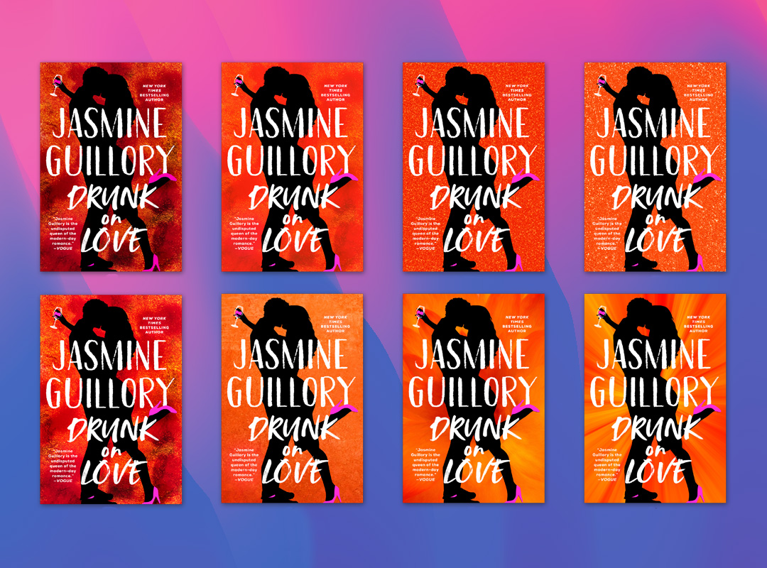
Rita: The background represents the passion between the characters almost electric in its vibrancy, we used special inks to achieve the concentrated hot orange color. The pop of pink in the details represents the romance, and the pose of the silhouettes of the couple is meant to capture that magical moment where one is swept away and is totally … drunk on love.
Cindy: The cover is strikingly bold yet subtle at the same time. Jasmine loved the care and attention Rita lavished on the seemingly simple elements to make them just right for the book — such as how the pink heart in the wine glass hints at rosé wine that came from the heroine’s winery, or how the bright rays of orange remind readers of the California sunshiney setting, or how the pink socks on the man give him a younger, more contemporary vibe, which is appropriate because he’s also five years younger than the heroine. Again, all simple and subtle details, but incredibly impactful on the final cover!
Check out the final design and get your copy of Drunk on Love by Jasmine Guillory:


