


An art director of any imprint does a number of things. But one of the most important is choosing what designer will work on each cover. In this case, Paul Sahre has always designed Chuck Klosterman’s jackets. And so the question was really, do we hire Paul to design the jacket, or do we do something else since this is Chuck’s first book with Blue Rider Press. It wasn’t a difficult decision, since Paul is one of the best book cover designers and his covers for Chuck are consistently fantastic.
Getting good work out of someone like Paul Sahre consists of letting him do the good work. And, at some level, having him feel that if he works to make something interesting, we will go with it, even if it is a little risky. So fighting for something that is interesting or risky is part of what I do, and I knew Paul was definitely going to deliver something that is smart and bold and different. In this instance there was certainly a risk in an upside down cover, but everyone here loved and thought it was perfect.
Working with and trusting my publisher, editors, sales and marketing and gaining their trust is another huge part of my job. Like any team working towards an end, there are many pieces that are cumulative, and the jacket can be a focal point of a lot of things. So fostering an environment with my designers and pushing my design to bring things to the table that I believe in, and then working with my editorial team to massage those jackets into something even better. That’s the goal.
As for a surprising thing someone outside of publishing might not know about my job; perhaps that I’m a reader and lover of books, and not just some art guy. Or that a graphic designer is more like an engineer or general problem solver—the end result just happens to be visual form. A design can be thought of as a set of constraints or parameters. In book design, these consist of things like the conceptual literary content of the book, what makes the book unique in the context of other similar books or all books, how the author is (or is not) known, the expectations of the book from the point of view of the author/editor/sales force/readers, the context of book jacket in the contemporary moment, the context of book jackets in the last 10 (or even 20) years, visual pop culture. Or something that is obvious and not obvious is working with type is very difficult. And it perhaps the most specialized thing that graphic designers bring to that general problem solving into form.

When you first start working on a book, what does that mean – what are your first steps?
There’s a combination of reading the manuscript, and listening to the editor talk about the book. As an art director, I have to dip into almost all the of the books to see what they are like before deciding to whom to give each title. As a designer (if I’m working on that title’s jacket) it’s always different with every book. But as a general process I will read the book, and think and sketch, and sketch, and reread, work though a number of ideas, throw most of them out, stay with others, reread, take a walk (much harder when you are also the art director), try to come up with something new. Those are the first steps.
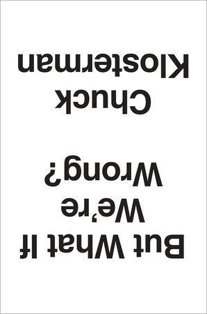
Please explain why you like the cover of But What if We’re Wrong? What did you most want it to convey?
As soon as I saw this design, I knew it was the best solution for the jacket. Fantastic.
The cover is simple and direct, but at the same time so “wrong.” It disrupts the expectation we have that things should be right-side up. And that’s exactly what the book questions; what do we assume to be right or decided about the world (take gravity for instance) and asks the simple question, “But…” The package brings you immediately to that kind of query and lets you know that Chuck is going to have some serious fun with the idea. It’s quirky but bold; not a gimmicky trick as much as a statement. Perfect for the book.
After everyone else saw it and also thought it was great, we talked about things like color and so on. But it would complicate the intent, bringing perhaps something else to muddy up the main thing. Keeping it black and white, keeping the type all the same typeface and size, moving the subtitle to the back, allows the one big move to be the clear and immediate thing that is experienced.

You read the manuscript to figure out your approach, and on this book you collaborated with a freelancer. What is that working relationship like? Do you brainstorm together? Do you suggest concepts?
When I work with a freelancer (as well as with my in-house designers), I like to see what they come up with without any input from me. Not only are you more likely to get something special and surprising, something you couldn’t have thought of yourself (which is why art directors work with a variety of freelancers in addition to their in-house staff), but you are sending a signal of trust. If a designer knows what “kind” of design they are expected to deliver, they might not push very far or hard. But if they take ownership of being the first arbiters of what the package of the book might be, there is more of a chance for something brilliant. I’m just trying to maximize the talent I have working with me.
With my in house staff, it is similar but there might also be a concept that is floating that we will work with. Or occasionally I’ll work with one designer or my whole team to come up with ideas together. That’s an exception though, and cover design is generally a sole enterprise in the initial stages. Then it becomes a collaboration when I see comps, and goes from there.
Who approves the cover design? Who has a say in the final cover?
It always depends. What we are really trying to make is a unique and powerful package that connects to the soul of the book. By the time we work through that process in-house, it’s hopefully the jacket that feels just right to the author and anyone else surrounding the book.
What makes certain piece of jacket art successful in your mind?
A jacket the feels unique, that stands alone and marks the book as an individual thing that is exciting and worth experiencing always wins the day. In the sea of book covers, a clever concept is not as strong as formal innovation. The great trick is to have something that is both visually stunning or startling that has a conceptual grounding or underlying connection to the book. Something that suggests something tangible but not literal about what’s inside. The jacket But What if We’re Wrong jacket is visually dynamic and unique because it’s upside down, which is also the conceptual move that leads you right into the book.
Check back next time for an interview with Paul Saher, the designer behind Klosterman’s cover art.
Read first post in this series here, and find out more about But What If We’re Wrong here:
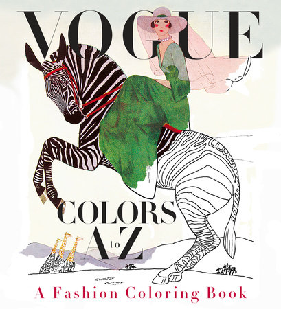
 When the idea was introduced to me in December 2015, it was soon apparent that reconstructing full-color vintage Vogue cover images into outline form would be a difficult challenge. Valerie Steiker, the Vogue Editor who conceived and assembled the project, sent Knopf’s editor, Shelley Wanger, four sample images at my request for testing. The alphabetical architecture of the book meant 26 images; when I studied them all, some of the covers were rendered simply with large mono-colored elements, others with the shadowing of garments with folds or the translucency of a diaphanous silky material, and the rest elaborated with rich details of texture and pattern. The goal of retaining the readability of the images, without the assistance of color, shading, and texture, was my immediate concern and challenge to figure out.
The first task was to de-colorize the image and delete the tonal gradations of the art. I had a pre-press vendor handle this in Photoshop, instructing them to retain as much of the skeletal outlines of the images as possible. But, the resulting image file retained just a soft, fuzzy outline, and many of the details got diminished in this filtering process. It was apparent that the services of an artist-illustrator would be needed to re-draw the art to enhance the line and embellish the image to suggest volume and delineate areas of detail for the colorist to fill in. A young, fashionable colleague of mine suggested her aunt, Cecilia Lehar, who did just this sort of inking. So, I wrote Cecilia, who years ago had coincidentally worked on Vogue patterns for 11 years, and worked on an exhibition, 250 years of Fashion, for the Philadelphia Museum of Art. I reviewed her portfolio, and asked her to prepare a line art version of the four pieces I had de-colorized. Her initial work was excellent: faithful to the original, yet now as a line rendering that could be successfully filled in with colors.
When the idea was introduced to me in December 2015, it was soon apparent that reconstructing full-color vintage Vogue cover images into outline form would be a difficult challenge. Valerie Steiker, the Vogue Editor who conceived and assembled the project, sent Knopf’s editor, Shelley Wanger, four sample images at my request for testing. The alphabetical architecture of the book meant 26 images; when I studied them all, some of the covers were rendered simply with large mono-colored elements, others with the shadowing of garments with folds or the translucency of a diaphanous silky material, and the rest elaborated with rich details of texture and pattern. The goal of retaining the readability of the images, without the assistance of color, shading, and texture, was my immediate concern and challenge to figure out.
The first task was to de-colorize the image and delete the tonal gradations of the art. I had a pre-press vendor handle this in Photoshop, instructing them to retain as much of the skeletal outlines of the images as possible. But, the resulting image file retained just a soft, fuzzy outline, and many of the details got diminished in this filtering process. It was apparent that the services of an artist-illustrator would be needed to re-draw the art to enhance the line and embellish the image to suggest volume and delineate areas of detail for the colorist to fill in. A young, fashionable colleague of mine suggested her aunt, Cecilia Lehar, who did just this sort of inking. So, I wrote Cecilia, who years ago had coincidentally worked on Vogue patterns for 11 years, and worked on an exhibition, 250 years of Fashion, for the Philadelphia Museum of Art. I reviewed her portfolio, and asked her to prepare a line art version of the four pieces I had de-colorized. Her initial work was excellent: faithful to the original, yet now as a line rendering that could be successfully filled in with colors.
 From that moment on, for the next month, it was meetings at Vogue and in my office to review the ensuing progress of Cecilia’s re-work of all the illustrated covers and incidental art throughout. In the book, each cover appears on the right side page of a spread, faced on the left page with the letter of the alphabet that corresponds to some element or theme of the cover image. Initially, the Vogue Deputy Design Director, Alberto Orta, chose a period-appropriate “Deco” border motif surrounding the letter of the alphabet, dramatic with contrasting black and white panels. We realized quickly that any solid filled-in area needed to be “emptied” to only an outline so another element of the book could be filled in with color by the book’s owner. And, each letter is further decorated by drawings evocative of the letter and cover image, which also needed to be re-drawn as line art. So, as the book took form, we added more and more colorable areas.
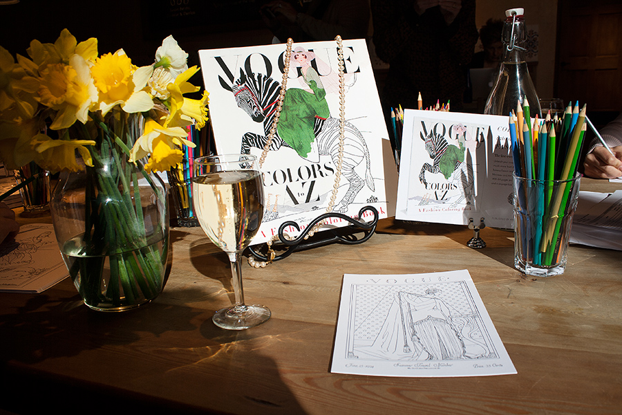
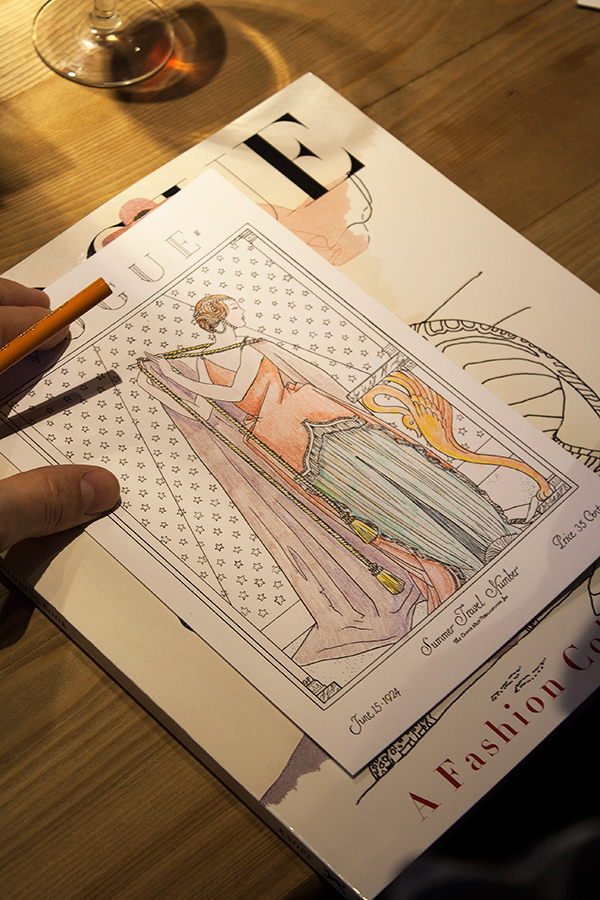 The book also includes a six-page barrel gatefold insert, perforated for removal from the book, comprised of 21 appareled models, consecutively arranged, representing the years 1912-1932. Again, each figure required re-drawing and refinements making them suitable for coloring. The cover of this paperback book features six-inch flaps (more figures to color!), and printed on the verso side of the cover, an array of the same decorative drawings that punctuate each letter within the book.
Manufacturing a book equal to the quality of Vogue’s historical covers required extensive research to identify the ideal paper to print on. The paper’s brightness, opacity and surface smoothness were all considered carefully, and finally, a 120-pound text (aka 65-pound cover) Accent Opaque paper was deemed perfect, but the next challenge was to make sure paper this thick could be folded well on the press equipment available for the large quantity of books being printed and the tight schedule we were dealing with. Press tests were conducted—luckily successful—though pushing at the limits of the equipment’s capabilities. Another embellishment to the book was including thumbnail-sized reproductions of the original covers (color elements are very uncommon in coloring books). Their reproduction was critical, and including these references of the original art allowed Valerie the opportunity to identify the cover images’ creators along with fascinating anecdotes, which further elevates
The book also includes a six-page barrel gatefold insert, perforated for removal from the book, comprised of 21 appareled models, consecutively arranged, representing the years 1912-1932. Again, each figure required re-drawing and refinements making them suitable for coloring. The cover of this paperback book features six-inch flaps (more figures to color!), and printed on the verso side of the cover, an array of the same decorative drawings that punctuate each letter within the book.
Manufacturing a book equal to the quality of Vogue’s historical covers required extensive research to identify the ideal paper to print on. The paper’s brightness, opacity and surface smoothness were all considered carefully, and finally, a 120-pound text (aka 65-pound cover) Accent Opaque paper was deemed perfect, but the next challenge was to make sure paper this thick could be folded well on the press equipment available for the large quantity of books being printed and the tight schedule we were dealing with. Press tests were conducted—luckily successful—though pushing at the limits of the equipment’s capabilities. Another embellishment to the book was including thumbnail-sized reproductions of the original covers (color elements are very uncommon in coloring books). Their reproduction was critical, and including these references of the original art allowed Valerie the opportunity to identify the cover images’ creators along with fascinating anecdotes, which further elevates 
 Seeing the book laid out this way brought me even deeper into the material–and was a lot of fun. By the end of the process, I knew we had a book that effectively draws readers into Tyler’s world, one moment at a time.
As the book hits stores, I’ll go back to my hurried ways, and my mad dash to collect facts and insights and cocktail party topics will continue apace. But I’ll try to hold on to that sense of wonder, and to find the courage to open my eyes just a little bit to the mystery and beauty all around us.
And I’ll look forward to working with Tyler on his third collection, coming out a year from now—another chance to learn, grow, and be inspired by an author who has the courage to share his true voice on every page.
Read more about All the Words Are Yours
Seeing the book laid out this way brought me even deeper into the material–and was a lot of fun. By the end of the process, I knew we had a book that effectively draws readers into Tyler’s world, one moment at a time.
As the book hits stores, I’ll go back to my hurried ways, and my mad dash to collect facts and insights and cocktail party topics will continue apace. But I’ll try to hold on to that sense of wonder, and to find the courage to open my eyes just a little bit to the mystery and beauty all around us.
And I’ll look forward to working with Tyler on his third collection, coming out a year from now—another chance to learn, grow, and be inspired by an author who has the courage to share his true voice on every page.
Read more about All the Words Are Yours 
 These past five weeks at Random House have been really educational and productive. I am interning in the Advertising/Promotions department, as well as the Art/Design department for the Random House Publishing Group imprint. Even on my first day I could tell that this was going to be a valuable experience that I would enjoy. Being an intern can be intimidating, but this is not the case at Random House. Everyone who works here is extremely humble, and friendly, and is eager to teach beginners the works of the business. It is an environment where teamwork is fostered, and the success of books is priority.
In the Art department I am being supervised by Paolo Pepe, the SVP & Creative Director. I have been reading manuscripts and learning how to design book covers using Adobe Creative Suite and hand illustration. This process has been really challenging because everyone involved in the process has a very specific image of how they think the cover should look. One book that I am working on has been in the cover development process for almost a year. It has been really interesting learning about the process from such talented designers, as well seeing the selection process from the publisher’s point of view. For the art department, I’ve also been creating mechanicals using Adobe Creative Suite, and creating templates for e-books.
In the Advertising and Promotions Department, I am being supervised by the Sr Director of Creative Services, Annette Melvin. For the department I have been using Adobe Creative Suite to create advertising materials for upcoming books, such as social media banners, and print ads. I’ve also been writing copy for upcoming book’s advertising campaigns.
These past five weeks at Random House have been really educational and productive. I am interning in the Advertising/Promotions department, as well as the Art/Design department for the Random House Publishing Group imprint. Even on my first day I could tell that this was going to be a valuable experience that I would enjoy. Being an intern can be intimidating, but this is not the case at Random House. Everyone who works here is extremely humble, and friendly, and is eager to teach beginners the works of the business. It is an environment where teamwork is fostered, and the success of books is priority.
In the Art department I am being supervised by Paolo Pepe, the SVP & Creative Director. I have been reading manuscripts and learning how to design book covers using Adobe Creative Suite and hand illustration. This process has been really challenging because everyone involved in the process has a very specific image of how they think the cover should look. One book that I am working on has been in the cover development process for almost a year. It has been really interesting learning about the process from such talented designers, as well seeing the selection process from the publisher’s point of view. For the art department, I’ve also been creating mechanicals using Adobe Creative Suite, and creating templates for e-books.
In the Advertising and Promotions Department, I am being supervised by the Sr Director of Creative Services, Annette Melvin. For the department I have been using Adobe Creative Suite to create advertising materials for upcoming books, such as social media banners, and print ads. I’ve also been writing copy for upcoming book’s advertising campaigns.


