We’re going deep inside the making of a book, with interviews from Penguin Random House employees in editorial, marketing, sales, and more. If you’ve ever wondered about all the behind-the-scenes work that goes into making your favorite books, this is the series for you.
Today we’re featuring an interview with Art Director, Jason Booher.
What does an Art Director do? What would surprise a layman to know about your job?
An art director of any imprint does a number of things. But one of the most important is choosing what designer will work on each cover. In this case, Paul Sahre has always designed Chuck Klosterman’s jackets. And so the question was really, do we hire Paul to design the jacket, or do we do something else since this is Chuck’s first book with Blue Rider Press. It wasn’t a difficult decision, since Paul is one of the best book cover designers and his covers for Chuck are consistently fantastic.
Getting good work out of someone like Paul Sahre consists of letting him do the good work. And, at some level, having him feel that if he works to make something interesting, we will go with it, even if it is a little risky. So fighting for something that is interesting or risky is part of what I do, and I knew Paul was definitely going to deliver something that is smart and bold and different. In this instance there was certainly a risk in an upside down cover, but everyone here loved and thought it was perfect.
Working with and trusting my publisher, editors, sales and marketing and gaining their trust is another huge part of my job. Like any team working towards an end, there are many pieces that are cumulative, and the jacket can be a focal point of a lot of things. So fostering an environment with my designers and pushing my design to bring things to the table that I believe in, and then working with my editorial team to massage those jackets into something even better. That’s the goal.
As for a surprising thing someone outside of publishing might not know about my job; perhaps that I’m a reader and lover of books, and not just some art guy. Or that a graphic designer is more like an engineer or general problem solver—the end result just happens to be visual form. A design can be thought of as a set of constraints or parameters. In book design, these consist of things like the conceptual literary content of the book, what makes the book unique in the context of other similar books or all books, how the author is (or is not) known, the expectations of the book from the point of view of the author/editor/sales force/readers, the context of book jacket in the contemporary moment, the context of book jackets in the last 10 (or even 20) years, visual pop culture. Or something that is obvious and not obvious is working with type is very difficult. And it perhaps the most specialized thing that graphic designers bring to that general problem solving into form.

When you first start working on a book, what does that mean – what are your first steps?
There’s a combination of reading the manuscript, and listening to the editor talk about the book. As an art director, I have to dip into almost all the of the books to see what they are like before deciding to whom to give each title. As a designer (if I’m working on that title’s jacket) it’s always different with every book. But as a general process I will read the book, and think and sketch, and sketch, and reread, work though a number of ideas, throw most of them out, stay with others, reread, take a walk (much harder when you are also the art director), try to come up with something new. Those are the first steps.
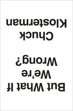
Please explain why you like the cover of But What if We’re Wrong? What did you most want it to convey?
As soon as I saw this design, I knew it was the best solution for the jacket. Fantastic.
The cover is simple and direct, but at the same time so “wrong.” It disrupts the expectation we have that things should be right-side up. And that’s exactly what the book questions; what do we assume to be right or decided about the world (take gravity for instance) and asks the simple question, “But…” The package brings you immediately to that kind of query and lets you know that Chuck is going to have some serious fun with the idea. It’s quirky but bold; not a gimmicky trick as much as a statement. Perfect for the book.
After everyone else saw it and also thought it was great, we talked about things like color and so on. But it would complicate the intent, bringing perhaps something else to muddy up the main thing. Keeping it black and white, keeping the type all the same typeface and size, moving the subtitle to the back, allows the one big move to be the clear and immediate thing that is experienced.

You read the manuscript to figure out your approach, and on this book you collaborated with a freelancer. What is that working relationship like? Do you brainstorm together? Do you suggest concepts?
When I work with a freelancer (as well as with my in-house designers), I like to see what they come up with without any input from me. Not only are you more likely to get something special and surprising, something you couldn’t have thought of yourself (which is why art directors work with a variety of freelancers in addition to their in-house staff), but you are sending a signal of trust. If a designer knows what “kind” of design they are expected to deliver, they might not push very far or hard. But if they take ownership of being the first arbiters of what the package of the book might be, there is more of a chance for something brilliant. I’m just trying to maximize the talent I have working with me.
With my in house staff, it is similar but there might also be a concept that is floating that we will work with. Or occasionally I’ll work with one designer or my whole team to come up with ideas together. That’s an exception though, and cover design is generally a sole enterprise in the initial stages. Then it becomes a collaboration when I see comps, and goes from there.
Who approves the cover design? Who has a say in the final cover?
It always depends. What we are really trying to make is a unique and powerful package that connects to the soul of the book. By the time we work through that process in-house, it’s hopefully the jacket that feels just right to the author and anyone else surrounding the book.
What makes certain piece of jacket art successful in your mind?
A jacket the feels unique, that stands alone and marks the book as an individual thing that is exciting and worth experiencing always wins the day. In the sea of book covers, a clever concept is not as strong as formal innovation. The great trick is to have something that is both visually stunning or startling that has a conceptual grounding or underlying connection to the book. Something that suggests something tangible but not literal about what’s inside. The jacket But What if We’re Wrong jacket is visually dynamic and unique because it’s upside down, which is also the conceptual move that leads you right into the book.
Check back next time for an interview with Paul Saher, the designer behind Klosterman’s cover art.
Read first post in this series here, and find out more about But What If We’re Wrong here:


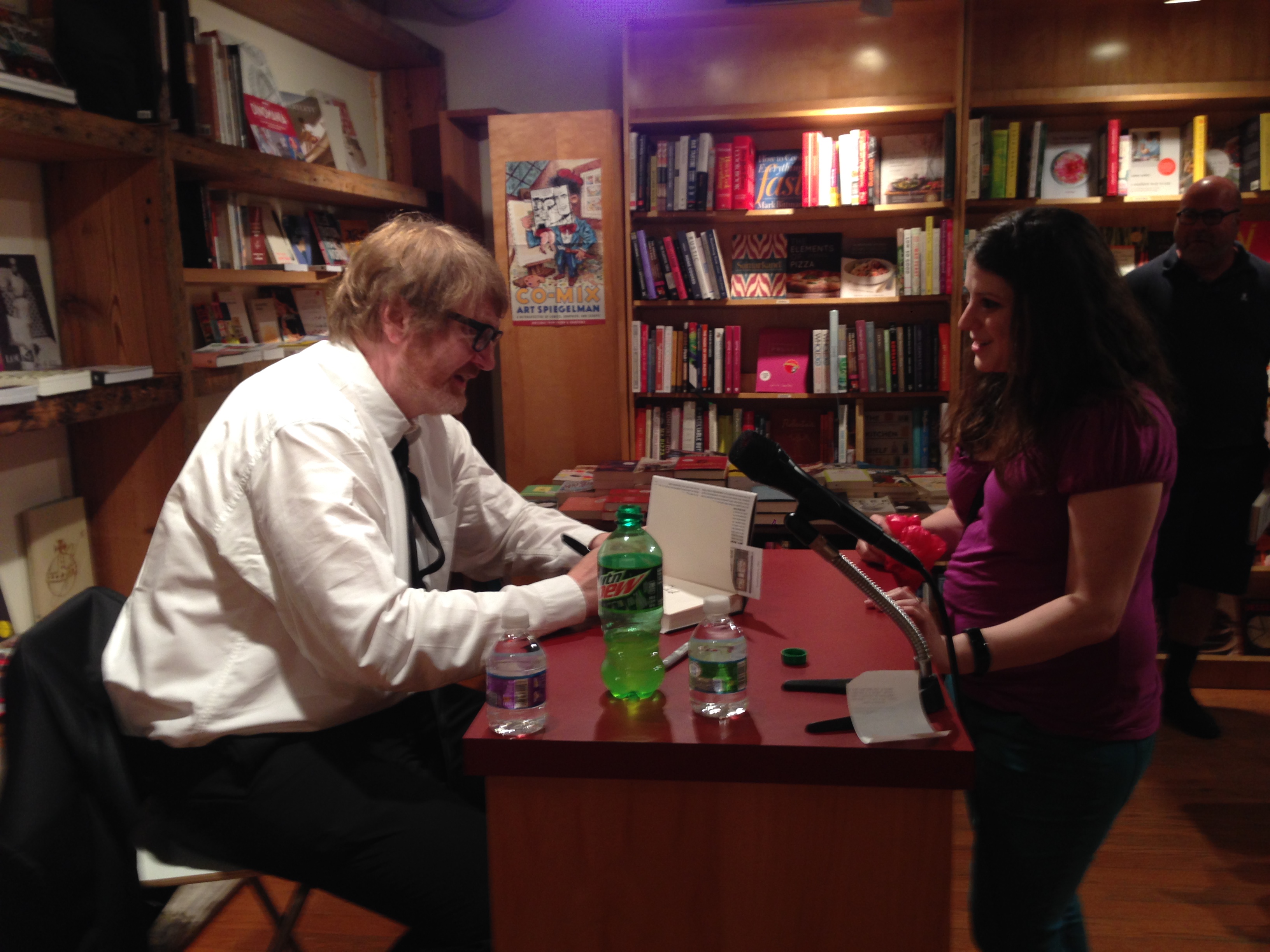
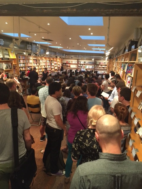
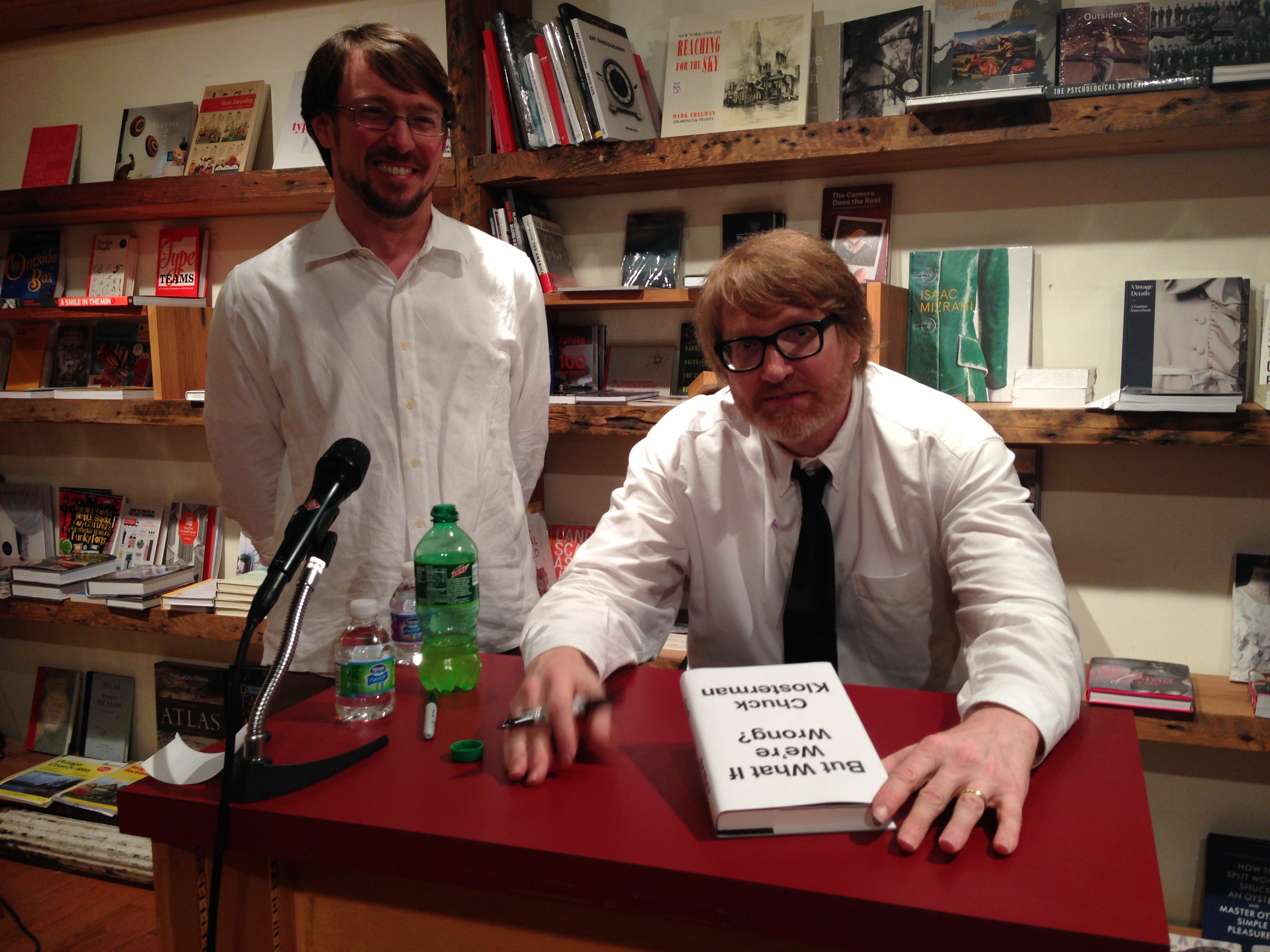
 Chuck read from his book and signed copies for fans… and it was a packed house!
 Today we’re featuring an interview with Andrew Unger, events and publicity manager of Brooklyn bookstore, BookCourt.
What is your job title, and what does that mean? What’s your day to day? What would surprise a layman to know?
I am the events and publicity manager. My daily schedule is varied and unpredictable, but focuses primarily on acting as the voice and public face of BookCourt. I manage our Twitter, Facebook, Instagram, and the back-end of the BookCourt website. I do all of this in addition to coordinating events for the store. We have one of the most robust calendars of any bookstore in the city, supporting over 300 authors every year. I think everyone, layman and professionals, are surprised to find out just how genuinely moved I am by the opportunity I have to work at one of the premier independent bookstores in the country.
What’s it like working at BookCourt vs. any other bookstore?
Jonathan Lethem has this wonderful quote he gave us once where he said that BookCourt was a university and a party in slow motion. I’ve always loved that way of talking about the store. As usual, Jonathan Lethem was able to put it so much better than me. On the weekends, we see a vast array of people. Old, young, local, tourist … it’s hard to not get a little whimsical about the “scene.” When you’re here and you’re the one that people look to for a recommendation or for a friendly conversation about one of your favorite books, it always feels almost too good to be true. I’ve only ever worked at BookCourt, but I don’t know that this particular blend of magic could be found anywhere else.
Today we’re featuring an interview with Andrew Unger, events and publicity manager of Brooklyn bookstore, BookCourt.
What is your job title, and what does that mean? What’s your day to day? What would surprise a layman to know?
I am the events and publicity manager. My daily schedule is varied and unpredictable, but focuses primarily on acting as the voice and public face of BookCourt. I manage our Twitter, Facebook, Instagram, and the back-end of the BookCourt website. I do all of this in addition to coordinating events for the store. We have one of the most robust calendars of any bookstore in the city, supporting over 300 authors every year. I think everyone, layman and professionals, are surprised to find out just how genuinely moved I am by the opportunity I have to work at one of the premier independent bookstores in the country.
What’s it like working at BookCourt vs. any other bookstore?
Jonathan Lethem has this wonderful quote he gave us once where he said that BookCourt was a university and a party in slow motion. I’ve always loved that way of talking about the store. As usual, Jonathan Lethem was able to put it so much better than me. On the weekends, we see a vast array of people. Old, young, local, tourist … it’s hard to not get a little whimsical about the “scene.” When you’re here and you’re the one that people look to for a recommendation or for a friendly conversation about one of your favorite books, it always feels almost too good to be true. I’ve only ever worked at BookCourt, but I don’t know that this particular blend of magic could be found anywhere else.
 When you order books from a publishing company, what do you consider? What makes a book attractive to you and your customers?
We have store bestseller list at the front. This list features the bestselling books from the previous week. Consistently, these books reflect the same taste as reviewers for the New York Times, the New Yorker, and the New York Review of Books. Our customers prefer something sophisticated and intellectually stimulating. Proud as all of us are of our libraries, there’s just no escaping a good cover. Many bad books have been sold through good cover designs and, far and away, too many great books have been relegated to a dusty corner of the shelf because of an ill-advised cover. Occasionally, a truly great book will arrive in the store. Gone Girl or Building Stories. These are anomalous and rise to the top with a momentum born from nowhere else except the compelling narrative itself.
When you order books from a publishing company, what do you consider? What makes a book attractive to you and your customers?
We have store bestseller list at the front. This list features the bestselling books from the previous week. Consistently, these books reflect the same taste as reviewers for the New York Times, the New Yorker, and the New York Review of Books. Our customers prefer something sophisticated and intellectually stimulating. Proud as all of us are of our libraries, there’s just no escaping a good cover. Many bad books have been sold through good cover designs and, far and away, too many great books have been relegated to a dusty corner of the shelf because of an ill-advised cover. Occasionally, a truly great book will arrive in the store. Gone Girl or Building Stories. These are anomalous and rise to the top with a momentum born from nowhere else except the compelling narrative itself.
 Tell me about some of the events and community-building at BookCourt.
In the early-aughts a Barnes & Noble opened up just a few blocks away from the store. It’s presence was intimidating and unwelcoming. The communities of Cobble Hill and Carroll Gardens rallied behind us in an impressive way. There are many great neighborhoods in New York, but these two have helped curate and foster one of the most impressive booms in Brooklyn. Today Court Street, as it runs from Atlantic Avenue into Red Hook, is ripe with local, family-owned businesses. In an age when small business is struggling for air, the residents of Cobble Hill and Carroll Gardens have created something truly special. Because of their dedication to us, we’ve dedicated ourselves to serving them. Our events are free and open to the public and through these events we are able to feature internationally celebrated authors as well as local and debut authors.
Tell me about some of the events and community-building at BookCourt.
In the early-aughts a Barnes & Noble opened up just a few blocks away from the store. It’s presence was intimidating and unwelcoming. The communities of Cobble Hill and Carroll Gardens rallied behind us in an impressive way. There are many great neighborhoods in New York, but these two have helped curate and foster one of the most impressive booms in Brooklyn. Today Court Street, as it runs from Atlantic Avenue into Red Hook, is ripe with local, family-owned businesses. In an age when small business is struggling for air, the residents of Cobble Hill and Carroll Gardens have created something truly special. Because of their dedication to us, we’ve dedicated ourselves to serving them. Our events are free and open to the public and through these events we are able to feature internationally celebrated authors as well as local and debut authors.
 What’s interesting to you about But What if We’re Wrong? How would you describe it to a reader? Why would they want to read it?
But What If We’re Wrong? was so engaging to me because it highlighted the best qualities of Chuck Klosterman’s personality. He is a friend of the store an often in and out. The writing is reflective of Chuck’s cadence and temperament. Thoroughly researched, he delivers prescient wisdom with a light-touch and a flare for the unexpected. The cover design, its simple, understated message of turning something on its head was ingenious and wonderful. I was the most surprised by how the footnotes at the bottom of the page operated as an aside to the reader in a way that looked at quick glance like a moniker of sophistication but read like a nudge and a wink. In almost every way, the book asked over and over again, the question of its title. Not often is a reading experience so cohesive and stream-lined.
What’s interesting to you about But What if We’re Wrong? How would you describe it to a reader? Why would they want to read it?
But What If We’re Wrong? was so engaging to me because it highlighted the best qualities of Chuck Klosterman’s personality. He is a friend of the store an often in and out. The writing is reflective of Chuck’s cadence and temperament. Thoroughly researched, he delivers prescient wisdom with a light-touch and a flare for the unexpected. The cover design, its simple, understated message of turning something on its head was ingenious and wonderful. I was the most surprised by how the footnotes at the bottom of the page operated as an aside to the reader in a way that looked at quick glance like a moniker of sophistication but read like a nudge and a wink. In almost every way, the book asked over and over again, the question of its title. Not often is a reading experience so cohesive and stream-lined.
 Which books are your go-to books to sell? Any old standbys?
People expect a booksellers to possess an intimate knowledge of not only all of their favorite books, but also of all the books they haven’t yet read. Great booksellers are up for the challenge. We all spend a lot of time pouring over reviews and ripping through as many books as we can. I don’t want to take the magic out of bookselling, but here are some pointers.
—Don’t recommend Bolano. Don’t be that guy. When you’re asked about it, gush appropriately because he’s amazing. Other writers that fall into this category are Don DeLillo, Thomas Pynchon, Dostoyevsky, J.D. Salinger, and Phillip Roth. (There’s a pattern)
—Listen, listen, listen. What did they do that day? What movies do they like? Are they quiet, nervous, excited, busy, jaded? Most of the time, people know what book they want, you just have to listen to them describe it and pull it off the shelf.
—Here is what you recommend in a pinch:
Which books are your go-to books to sell? Any old standbys?
People expect a booksellers to possess an intimate knowledge of not only all of their favorite books, but also of all the books they haven’t yet read. Great booksellers are up for the challenge. We all spend a lot of time pouring over reviews and ripping through as many books as we can. I don’t want to take the magic out of bookselling, but here are some pointers.
—Don’t recommend Bolano. Don’t be that guy. When you’re asked about it, gush appropriately because he’s amazing. Other writers that fall into this category are Don DeLillo, Thomas Pynchon, Dostoyevsky, J.D. Salinger, and Phillip Roth. (There’s a pattern)
—Listen, listen, listen. What did they do that day? What movies do they like? Are they quiet, nervous, excited, busy, jaded? Most of the time, people know what book they want, you just have to listen to them describe it and pull it off the shelf.
—Here is what you recommend in a pinch:


 Q: Do you have a favorite part of the editorial and publishing process?
A: I have a few. First, there’s the moment when you realize that you want to work on a book. It’s not unlike the beginning of a romance, minus all of the untoward activities, of course. Then there’s the editing. It’s definitely work, and sometimes it’s more work than anticipated, but, when you can shut out the world and really interact with what someone has written—ask them more questions, challenge them a bit, and just enjoy it like any reader would—that’s entertaining. It’s a heightened form of reading. And, last but not least, there are moments when you can tell that a reader (other than yourself) has genuinely loved a book. Whether it’s a rave review or a crowd of people at an author’s event who are obviously enjoying themselves, or someone on the subway reading one of your books with an intent (but not displeased) look on his or her face. I have a cynical side, like anyone else, but those are the things that have a way of eroding it, at least until the next moment of pain and disappointment comes along.
Q: Do you have a favorite part of the editorial and publishing process?
A: I have a few. First, there’s the moment when you realize that you want to work on a book. It’s not unlike the beginning of a romance, minus all of the untoward activities, of course. Then there’s the editing. It’s definitely work, and sometimes it’s more work than anticipated, but, when you can shut out the world and really interact with what someone has written—ask them more questions, challenge them a bit, and just enjoy it like any reader would—that’s entertaining. It’s a heightened form of reading. And, last but not least, there are moments when you can tell that a reader (other than yourself) has genuinely loved a book. Whether it’s a rave review or a crowd of people at an author’s event who are obviously enjoying themselves, or someone on the subway reading one of your books with an intent (but not displeased) look on his or her face. I have a cynical side, like anyone else, but those are the things that have a way of eroding it, at least until the next moment of pain and disappointment comes along.
 Q: Do you have a favorite section or quote from But What if We’re Wrong?

 Q: How would you describe this book to someone who’s never read Chuck?
A: Imagine you’re about to meet up at a bar (or any other kind of location where you can relax and enjoy yourself) with several of your best friends. You’re going to discuss both important and completely unimportant subjects. You’re going to play some songs on the jukebox, which might lead you to ponder the career of Gerry Rafferty. You’re going to casually watch whatever games are on. You’ll argue, you’ll laugh—both with and at each other—and you might be surprised by a good friend’s revelation or news. And, unless someone loses a tooth or a credit card, you’ll have a good time, living in a world where not all times are good.
Reading Chuck is the literary equivalent of that night out. There’s part of me that hesitates to characterize his work in that way because I fear it implies, to some people, a lack of quality, which is not what I’m trying to convey at all. In fact, if that’s what you think it implies, then maybe you need some new best friends.
This book, specifically, asks—in every which way—what we, as individuals and as a society, might be wrong about. We look back in history and it’s obvious to us that people have always been wrong about major facts or issues at any given time, yet it’s difficult to apply that same scrutiny to the present. Chuck tries. He looks at art, science, politics, sports, dreaming, the fabric of reality, and just about everything else. He consults experts in each field, and he draws some fascinating conclusions about how we think about what we know, or don’t know.
Q: How would you describe this book to someone who’s never read Chuck?
A: Imagine you’re about to meet up at a bar (or any other kind of location where you can relax and enjoy yourself) with several of your best friends. You’re going to discuss both important and completely unimportant subjects. You’re going to play some songs on the jukebox, which might lead you to ponder the career of Gerry Rafferty. You’re going to casually watch whatever games are on. You’ll argue, you’ll laugh—both with and at each other—and you might be surprised by a good friend’s revelation or news. And, unless someone loses a tooth or a credit card, you’ll have a good time, living in a world where not all times are good.
Reading Chuck is the literary equivalent of that night out. There’s part of me that hesitates to characterize his work in that way because I fear it implies, to some people, a lack of quality, which is not what I’m trying to convey at all. In fact, if that’s what you think it implies, then maybe you need some new best friends.
This book, specifically, asks—in every which way—what we, as individuals and as a society, might be wrong about. We look back in history and it’s obvious to us that people have always been wrong about major facts or issues at any given time, yet it’s difficult to apply that same scrutiny to the present. Chuck tries. He looks at art, science, politics, sports, dreaming, the fabric of reality, and just about everything else. He consults experts in each field, and he draws some fascinating conclusions about how we think about what we know, or don’t know.
 Q: What would surprise a layman about the editing and publishing process?
A: People who are unfamiliar with the publishing industry probably don’t realize the extent to which editors are involved in a book at every step from signing it up to editing it (they probably can guess about that part) to publishing it to finding ways to promote it years later. Editors depend on countless colleagues in production, design, sales, publicity, marketing, rights, and legal—not to mention booksellers and media and partners outside of the publishing house—but an editor is generally involved throughout the entire process. An editor is the author’s primary connection to the publishing house. Maybe a layman knows all of this. Sometimes that guy is smarter than we think.
Q: What do you look for when you acquire a book? How does that apply to But What if We’re Wrong?
A: It’s relatively simple: I look for books I love to read. Of course, I have particular interests in music, pop culture, sports, counterculture, and quirky/weird/wild subjects, so most of the books I look for relate to one or more of those realms, but I also love a writer who can pull me into a subject I was never expecting to want to read about. That takes a distinct voice and command of language, and usually some sense of levity, which can range from subtle to outlandish.
As for Chuck, I’ve been working with him since the beginning of his literary career, which was essentially the beginning of my career as an editor. In 1999, I was a novice editor, but I’d been trained to look for writers and books, applying the aforementioned principles, and I’m extremely fortunate to have been in the right place at the right time to start working with Chuck. The way in which he typifies the kind of writer I enjoy reading cannot be overstated.
Q: What would surprise a layman about the editing and publishing process?
A: People who are unfamiliar with the publishing industry probably don’t realize the extent to which editors are involved in a book at every step from signing it up to editing it (they probably can guess about that part) to publishing it to finding ways to promote it years later. Editors depend on countless colleagues in production, design, sales, publicity, marketing, rights, and legal—not to mention booksellers and media and partners outside of the publishing house—but an editor is generally involved throughout the entire process. An editor is the author’s primary connection to the publishing house. Maybe a layman knows all of this. Sometimes that guy is smarter than we think.
Q: What do you look for when you acquire a book? How does that apply to But What if We’re Wrong?
A: It’s relatively simple: I look for books I love to read. Of course, I have particular interests in music, pop culture, sports, counterculture, and quirky/weird/wild subjects, so most of the books I look for relate to one or more of those realms, but I also love a writer who can pull me into a subject I was never expecting to want to read about. That takes a distinct voice and command of language, and usually some sense of levity, which can range from subtle to outlandish.
As for Chuck, I’ve been working with him since the beginning of his literary career, which was essentially the beginning of my career as an editor. In 1999, I was a novice editor, but I’d been trained to look for writers and books, applying the aforementioned principles, and I’m extremely fortunate to have been in the right place at the right time to start working with Chuck. The way in which he typifies the kind of writer I enjoy reading cannot be overstated.
 Q: What’s the first thing you do after acquiring a book? How do you start the editing process? How do you collaborate with Chuck? How has it changed since his first book?
A: Usually, in the process of acquiring a book, an editor has had some kind of conversation with the author. So, the first step is usually an extension of that conversation, and just getting to know each other a little bit. If the writer is in New York, I take him or her to lunch. We talk about logistics of the project and the general approach the writer is going to take with the book.
With Chuck, this is the eighth book we’ve worked on together, and we know each other well. We’re pals who’ve watched approximately fifty college football games while sitting in the same room. But I still take him to lunch sometimes. We usually have three big conversations about a given book—one before he starts writing, one after he’s been writing for a while, and one before he delivers the first complete draft. Then we have lots of little conversations and email exchanges until the book is ready to go to the printer. That hasn’t changed a lot over the years.
Check back soon for Part 2., in which Rumble describes his favorite parts of the editorial process and the most striking chapters of But What If We’re Wrong?.
Read the first post in this series
Q: What’s the first thing you do after acquiring a book? How do you start the editing process? How do you collaborate with Chuck? How has it changed since his first book?
A: Usually, in the process of acquiring a book, an editor has had some kind of conversation with the author. So, the first step is usually an extension of that conversation, and just getting to know each other a little bit. If the writer is in New York, I take him or her to lunch. We talk about logistics of the project and the general approach the writer is going to take with the book.
With Chuck, this is the eighth book we’ve worked on together, and we know each other well. We’re pals who’ve watched approximately fifty college football games while sitting in the same room. But I still take him to lunch sometimes. We usually have three big conversations about a given book—one before he starts writing, one after he’s been writing for a while, and one before he delivers the first complete draft. Then we have lots of little conversations and email exchanges until the book is ready to go to the printer. That hasn’t changed a lot over the years.
Check back soon for Part 2., in which Rumble describes his favorite parts of the editorial process and the most striking chapters of But What If We’re Wrong?.
Read the first post in this series 
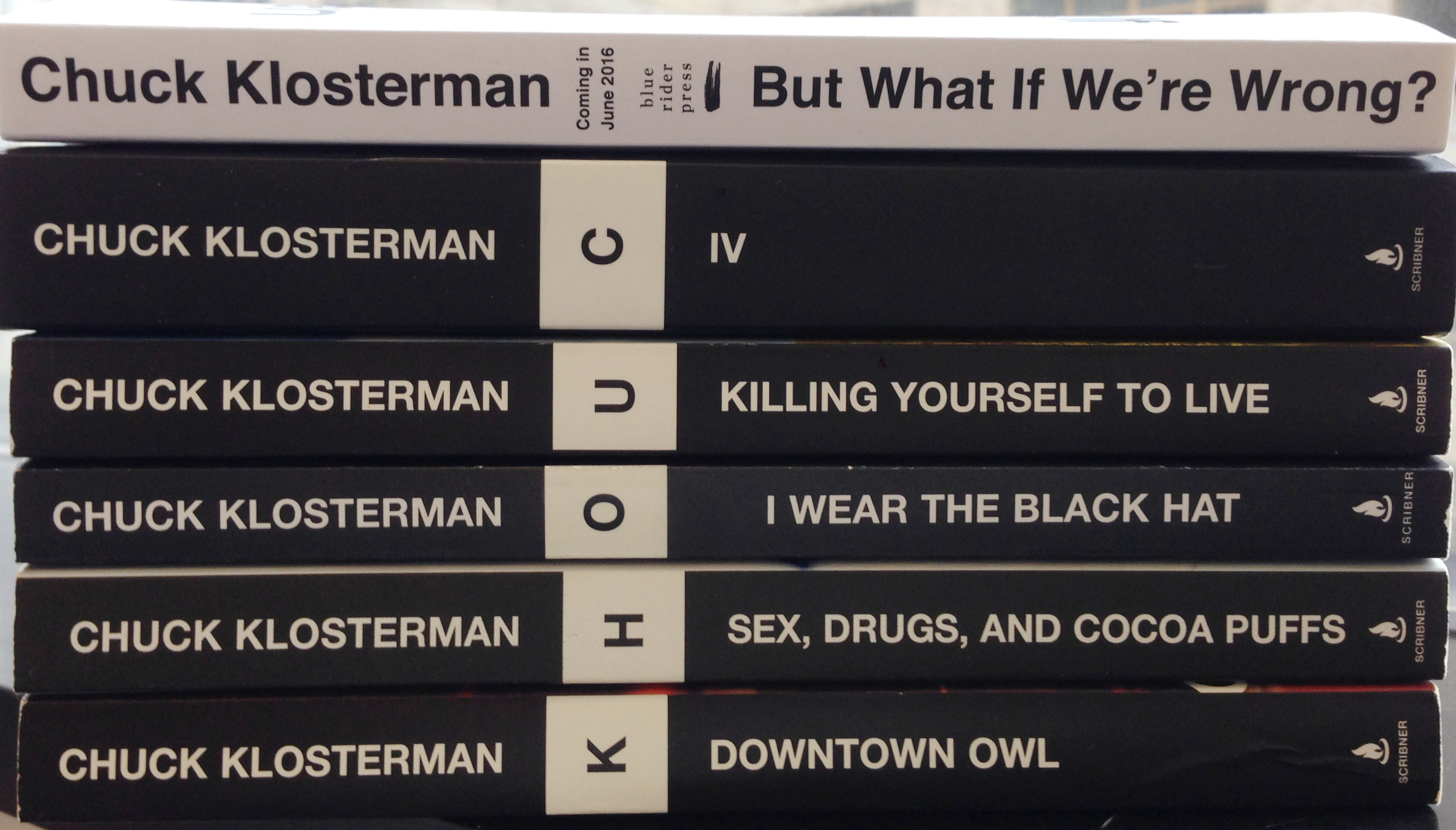 Chuck Klosterman is an author and essayist known for his books (Sex, Drugs, and Cocoa Puffs, Eating the Dinosaur, and Fargo Rock City, among others), and his columns and articles for GQ, Esquire, Grantland, Spin, and The New York Times Magazine. His newest book,
  Read more about But What If We’re Wrong? below.


