


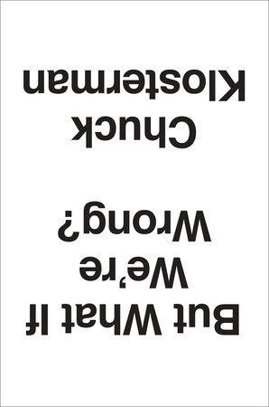
Where to start? In this particular case, the reader should feel free to judge a book by its cover: the contents may turn your worldview upside down, or at least challenge you.
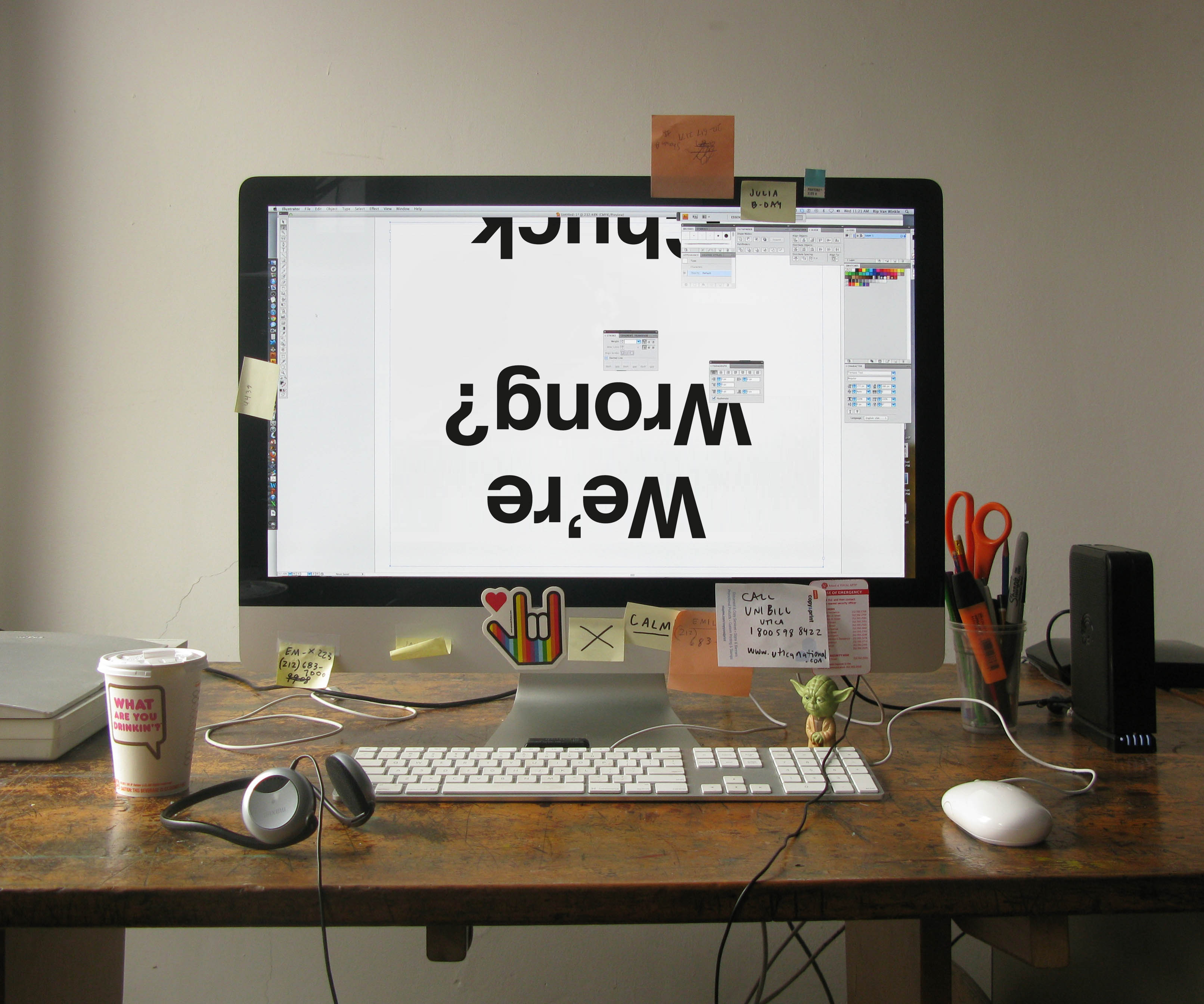
Designer Paul Sahre and art director Jason Booher hit it out of the park – this book could sit under glass at the Whitney and fit right in. Great design is such a helpful tool for a publicist to get the media’s attention as well as to stand out in a bookstore.
Now that we’ve gotten the reader to pick the book up, what should they expect between the covers? This is where the fun really begins. Chuck is a brilliant cultural commentator, not only in the way that he makes a point or constructs an argument, but in how he gets the reader thinking. But What If We’re Wrong? has something for everyone: literature, music, politics, science, philosophy and more. I’m not a sports person, but the chapter on football is fantastic and now I can drop that knowledge on my brother-in-law (finally). Other readers will likewise learn a few things, without question.
How would you describe your job and how you worked on But What If We’re Wrong? to a layman? What are some of the steps you take when you first start working on a title?
I’ll start with the end goal of my job: to have a reader discover a new book and get interested enough to buy it.
Booksellers, media and social media influencers are my outside partners to help me reach this goal. Booksellers have events. The media does reviews or interviews. Social media allows us to talk to readers or those they care about directly. My job, alongside my brilliant team, is to pull all of these levers for a book’s publication.
When a dynamic and popular writer like Chuck pens a provocative, forward-thinking book that can be read by a wide variety of people, I’ve got a lot to work with. I collaborated with author, publisher, editor and agent to set goals of how we wanted to reach readers and the message we wanted to convey. We started working on this early –about nine months (or more) ago. It’s exciting to be almost at the point of publication after all of this anticipation in-house.
Describe the book in one sentence.
A book that makes a persuasive case for the importance of doubt – sorely needed in an age where we think we know everything.

Do you have a favorite line from the book, or a section you particularly love?
While there is no material benefit to being right about a future you will not experience “there are intrinsic benefits,” Klosterman writes, “to constantly probing the possibility that our assumptions about the future might be wrong: humility and wonder. It’s good to view reality as being beyond our understanding, because it is. And it’s exciting to imagine the prospect of a reality that cannot be imagined, because that’s as close to pansophical omniscience as we will ever come.”
How closely do you work with the editor, art department, etc. when working on a title?
All members of our imprint work closely together. Publicity and marketing is the midwife in a book’s birth. The book has been gestating for a while– being written, edited, designed, printed, sold in by reps etc. – but then the labor begins, in the form of a publicity tour which can be physically exhausting and maybe even painful at times. But publicists are there at the crucial moment of publication day (a book’s birthday!) and when it’s well-received and sells lots of copies, I personally feel happy and proud by association.
(I might be saying this because my daughter kept me up last night and Chuck and his wife just had a baby, but I think the analogy is apt!)
Read first post in this series here, and find out more about But What If We’re Wrong here:


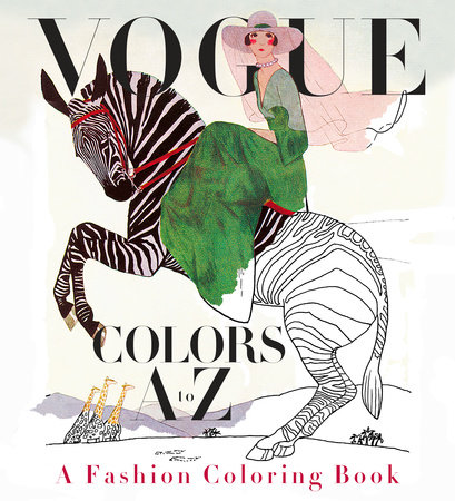
 When the idea was introduced to me in December 2015, it was soon apparent that reconstructing full-color vintage Vogue cover images into outline form would be a difficult challenge. Valerie Steiker, the Vogue Editor who conceived and assembled the project, sent Knopf’s editor, Shelley Wanger, four sample images at my request for testing. The alphabetical architecture of the book meant 26 images; when I studied them all, some of the covers were rendered simply with large mono-colored elements, others with the shadowing of garments with folds or the translucency of a diaphanous silky material, and the rest elaborated with rich details of texture and pattern. The goal of retaining the readability of the images, without the assistance of color, shading, and texture, was my immediate concern and challenge to figure out.
The first task was to de-colorize the image and delete the tonal gradations of the art. I had a pre-press vendor handle this in Photoshop, instructing them to retain as much of the skeletal outlines of the images as possible. But, the resulting image file retained just a soft, fuzzy outline, and many of the details got diminished in this filtering process. It was apparent that the services of an artist-illustrator would be needed to re-draw the art to enhance the line and embellish the image to suggest volume and delineate areas of detail for the colorist to fill in. A young, fashionable colleague of mine suggested her aunt, Cecilia Lehar, who did just this sort of inking. So, I wrote Cecilia, who years ago had coincidentally worked on Vogue patterns for 11 years, and worked on an exhibition, 250 years of Fashion, for the Philadelphia Museum of Art. I reviewed her portfolio, and asked her to prepare a line art version of the four pieces I had de-colorized. Her initial work was excellent: faithful to the original, yet now as a line rendering that could be successfully filled in with colors.
When the idea was introduced to me in December 2015, it was soon apparent that reconstructing full-color vintage Vogue cover images into outline form would be a difficult challenge. Valerie Steiker, the Vogue Editor who conceived and assembled the project, sent Knopf’s editor, Shelley Wanger, four sample images at my request for testing. The alphabetical architecture of the book meant 26 images; when I studied them all, some of the covers were rendered simply with large mono-colored elements, others with the shadowing of garments with folds or the translucency of a diaphanous silky material, and the rest elaborated with rich details of texture and pattern. The goal of retaining the readability of the images, without the assistance of color, shading, and texture, was my immediate concern and challenge to figure out.
The first task was to de-colorize the image and delete the tonal gradations of the art. I had a pre-press vendor handle this in Photoshop, instructing them to retain as much of the skeletal outlines of the images as possible. But, the resulting image file retained just a soft, fuzzy outline, and many of the details got diminished in this filtering process. It was apparent that the services of an artist-illustrator would be needed to re-draw the art to enhance the line and embellish the image to suggest volume and delineate areas of detail for the colorist to fill in. A young, fashionable colleague of mine suggested her aunt, Cecilia Lehar, who did just this sort of inking. So, I wrote Cecilia, who years ago had coincidentally worked on Vogue patterns for 11 years, and worked on an exhibition, 250 years of Fashion, for the Philadelphia Museum of Art. I reviewed her portfolio, and asked her to prepare a line art version of the four pieces I had de-colorized. Her initial work was excellent: faithful to the original, yet now as a line rendering that could be successfully filled in with colors.
 From that moment on, for the next month, it was meetings at Vogue and in my office to review the ensuing progress of Cecilia’s re-work of all the illustrated covers and incidental art throughout. In the book, each cover appears on the right side page of a spread, faced on the left page with the letter of the alphabet that corresponds to some element or theme of the cover image. Initially, the Vogue Deputy Design Director, Alberto Orta, chose a period-appropriate “Deco” border motif surrounding the letter of the alphabet, dramatic with contrasting black and white panels. We realized quickly that any solid filled-in area needed to be “emptied” to only an outline so another element of the book could be filled in with color by the book’s owner. And, each letter is further decorated by drawings evocative of the letter and cover image, which also needed to be re-drawn as line art. So, as the book took form, we added more and more colorable areas.
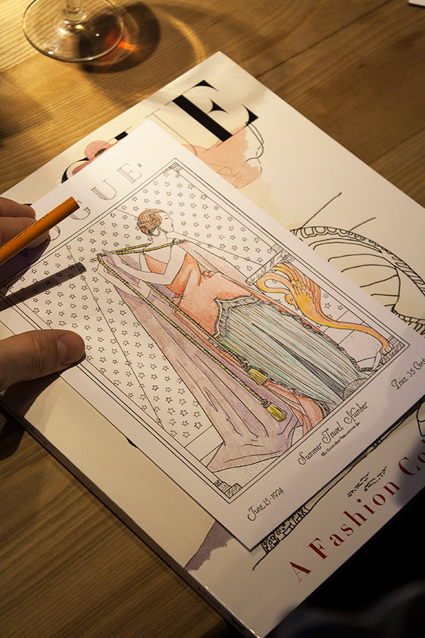 The book also includes a six-page barrel gatefold insert, perforated for removal from the book, comprised of 21 appareled models, consecutively arranged, representing the years 1912-1932. Again, each figure required re-drawing and refinements making them suitable for coloring. The cover of this paperback book features six-inch flaps (more figures to color!), and printed on the verso side of the cover, an array of the same decorative drawings that punctuate each letter within the book.
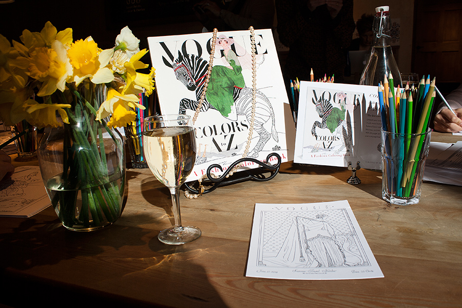
Manufacturing a book equal to the quality of Vogue’s historical covers required extensive research to identify the ideal paper to print on. The paper’s brightness, opacity and surface smoothness were all considered carefully, and finally, a 120-pound text (aka 65-pound cover) Accent Opaque paper was deemed perfect, but the next challenge was to make sure paper this thick could be folded well on the press equipment available for the large quantity of books being printed and the tight schedule we were dealing with. Press tests were conducted—luckily successful—though pushing at the limits of the equipment’s capabilities. Another embellishment to the book was including thumbnail-sized reproductions of the original covers (color elements are very uncommon in coloring books). Their reproduction was critical, and including these references of the original art allowed Valerie the opportunity to identify the cover images’ creators along with fascinating anecdotes, which further elevates
The book also includes a six-page barrel gatefold insert, perforated for removal from the book, comprised of 21 appareled models, consecutively arranged, representing the years 1912-1932. Again, each figure required re-drawing and refinements making them suitable for coloring. The cover of this paperback book features six-inch flaps (more figures to color!), and printed on the verso side of the cover, an array of the same decorative drawings that punctuate each letter within the book.
Manufacturing a book equal to the quality of Vogue’s historical covers required extensive research to identify the ideal paper to print on. The paper’s brightness, opacity and surface smoothness were all considered carefully, and finally, a 120-pound text (aka 65-pound cover) Accent Opaque paper was deemed perfect, but the next challenge was to make sure paper this thick could be folded well on the press equipment available for the large quantity of books being printed and the tight schedule we were dealing with. Press tests were conducted—luckily successful—though pushing at the limits of the equipment’s capabilities. Another embellishment to the book was including thumbnail-sized reproductions of the original covers (color elements are very uncommon in coloring books). Their reproduction was critical, and including these references of the original art allowed Valerie the opportunity to identify the cover images’ creators along with fascinating anecdotes, which further elevates  Q: Do you have a favorite part of the editorial and publishing process?
A: I have a few. First, there’s the moment when you realize that you want to work on a book. It’s not unlike the beginning of a romance, minus all of the untoward activities, of course. Then there’s the editing. It’s definitely work, and sometimes it’s more work than anticipated, but, when you can shut out the world and really interact with what someone has written—ask them more questions, challenge them a bit, and just enjoy it like any reader would—that’s entertaining. It’s a heightened form of reading. And, last but not least, there are moments when you can tell that a reader (other than yourself) has genuinely loved a book. Whether it’s a rave review or a crowd of people at an author’s event who are obviously enjoying themselves, or someone on the subway reading one of your books with an intent (but not displeased) look on his or her face. I have a cynical side, like anyone else, but those are the things that have a way of eroding it, at least until the next moment of pain and disappointment comes along.
Q: Do you have a favorite part of the editorial and publishing process?
A: I have a few. First, there’s the moment when you realize that you want to work on a book. It’s not unlike the beginning of a romance, minus all of the untoward activities, of course. Then there’s the editing. It’s definitely work, and sometimes it’s more work than anticipated, but, when you can shut out the world and really interact with what someone has written—ask them more questions, challenge them a bit, and just enjoy it like any reader would—that’s entertaining. It’s a heightened form of reading. And, last but not least, there are moments when you can tell that a reader (other than yourself) has genuinely loved a book. Whether it’s a rave review or a crowd of people at an author’s event who are obviously enjoying themselves, or someone on the subway reading one of your books with an intent (but not displeased) look on his or her face. I have a cynical side, like anyone else, but those are the things that have a way of eroding it, at least until the next moment of pain and disappointment comes along.
 Q: Do you have a favorite section or quote from But What if We’re Wrong?


 Q: How would you describe this book to someone who’s never read Chuck?
A: Imagine you’re about to meet up at a bar (or any other kind of location where you can relax and enjoy yourself) with several of your best friends. You’re going to discuss both important and completely unimportant subjects. You’re going to play some songs on the jukebox, which might lead you to ponder the career of Gerry Rafferty. You’re going to casually watch whatever games are on. You’ll argue, you’ll laugh—both with and at each other—and you might be surprised by a good friend’s revelation or news. And, unless someone loses a tooth or a credit card, you’ll have a good time, living in a world where not all times are good.
Reading Chuck is the literary equivalent of that night out. There’s part of me that hesitates to characterize his work in that way because I fear it implies, to some people, a lack of quality, which is not what I’m trying to convey at all. In fact, if that’s what you think it implies, then maybe you need some new best friends.
This book, specifically, asks—in every which way—what we, as individuals and as a society, might be wrong about. We look back in history and it’s obvious to us that people have always been wrong about major facts or issues at any given time, yet it’s difficult to apply that same scrutiny to the present. Chuck tries. He looks at art, science, politics, sports, dreaming, the fabric of reality, and just about everything else. He consults experts in each field, and he draws some fascinating conclusions about how we think about what we know, or don’t know.
Q: How would you describe this book to someone who’s never read Chuck?
A: Imagine you’re about to meet up at a bar (or any other kind of location where you can relax and enjoy yourself) with several of your best friends. You’re going to discuss both important and completely unimportant subjects. You’re going to play some songs on the jukebox, which might lead you to ponder the career of Gerry Rafferty. You’re going to casually watch whatever games are on. You’ll argue, you’ll laugh—both with and at each other—and you might be surprised by a good friend’s revelation or news. And, unless someone loses a tooth or a credit card, you’ll have a good time, living in a world where not all times are good.
Reading Chuck is the literary equivalent of that night out. There’s part of me that hesitates to characterize his work in that way because I fear it implies, to some people, a lack of quality, which is not what I’m trying to convey at all. In fact, if that’s what you think it implies, then maybe you need some new best friends.
This book, specifically, asks—in every which way—what we, as individuals and as a society, might be wrong about. We look back in history and it’s obvious to us that people have always been wrong about major facts or issues at any given time, yet it’s difficult to apply that same scrutiny to the present. Chuck tries. He looks at art, science, politics, sports, dreaming, the fabric of reality, and just about everything else. He consults experts in each field, and he draws some fascinating conclusions about how we think about what we know, or don’t know.
 Q: What would surprise a layman about the editing and publishing process?
A: People who are unfamiliar with the publishing industry probably don’t realize the extent to which editors are involved in a book at every step from signing it up to editing it (they probably can guess about that part) to publishing it to finding ways to promote it years later. Editors depend on countless colleagues in production, design, sales, publicity, marketing, rights, and legal—not to mention booksellers and media and partners outside of the publishing house—but an editor is generally involved throughout the entire process. An editor is the author’s primary connection to the publishing house. Maybe a layman knows all of this. Sometimes that guy is smarter than we think.
Q: What do you look for when you acquire a book? How does that apply to But What if We’re Wrong?
A: It’s relatively simple: I look for books I love to read. Of course, I have particular interests in music, pop culture, sports, counterculture, and quirky/weird/wild subjects, so most of the books I look for relate to one or more of those realms, but I also love a writer who can pull me into a subject I was never expecting to want to read about. That takes a distinct voice and command of language, and usually some sense of levity, which can range from subtle to outlandish.
As for Chuck, I’ve been working with him since the beginning of his literary career, which was essentially the beginning of my career as an editor. In 1999, I was a novice editor, but I’d been trained to look for writers and books, applying the aforementioned principles, and I’m extremely fortunate to have been in the right place at the right time to start working with Chuck. The way in which he typifies the kind of writer I enjoy reading cannot be overstated.
Q: What would surprise a layman about the editing and publishing process?
A: People who are unfamiliar with the publishing industry probably don’t realize the extent to which editors are involved in a book at every step from signing it up to editing it (they probably can guess about that part) to publishing it to finding ways to promote it years later. Editors depend on countless colleagues in production, design, sales, publicity, marketing, rights, and legal—not to mention booksellers and media and partners outside of the publishing house—but an editor is generally involved throughout the entire process. An editor is the author’s primary connection to the publishing house. Maybe a layman knows all of this. Sometimes that guy is smarter than we think.
Q: What do you look for when you acquire a book? How does that apply to But What if We’re Wrong?
A: It’s relatively simple: I look for books I love to read. Of course, I have particular interests in music, pop culture, sports, counterculture, and quirky/weird/wild subjects, so most of the books I look for relate to one or more of those realms, but I also love a writer who can pull me into a subject I was never expecting to want to read about. That takes a distinct voice and command of language, and usually some sense of levity, which can range from subtle to outlandish.
As for Chuck, I’ve been working with him since the beginning of his literary career, which was essentially the beginning of my career as an editor. In 1999, I was a novice editor, but I’d been trained to look for writers and books, applying the aforementioned principles, and I’m extremely fortunate to have been in the right place at the right time to start working with Chuck. The way in which he typifies the kind of writer I enjoy reading cannot be overstated.
 Q: What’s the first thing you do after acquiring a book? How do you start the editing process? How do you collaborate with Chuck? How has it changed since his first book?
A: Usually, in the process of acquiring a book, an editor has had some kind of conversation with the author. So, the first step is usually an extension of that conversation, and just getting to know each other a little bit. If the writer is in New York, I take him or her to lunch. We talk about logistics of the project and the general approach the writer is going to take with the book.
With Chuck, this is the eighth book we’ve worked on together, and we know each other well. We’re pals who’ve watched approximately fifty college football games while sitting in the same room. But I still take him to lunch sometimes. We usually have three big conversations about a given book—one before he starts writing, one after he’s been writing for a while, and one before he delivers the first complete draft. Then we have lots of little conversations and email exchanges until the book is ready to go to the printer. That hasn’t changed a lot over the years.
Check back soon for Part 2., in which Rumble describes his favorite parts of the editorial process and the most striking chapters of But What If We’re Wrong?.
Read the first post in this series
Q: What’s the first thing you do after acquiring a book? How do you start the editing process? How do you collaborate with Chuck? How has it changed since his first book?
A: Usually, in the process of acquiring a book, an editor has had some kind of conversation with the author. So, the first step is usually an extension of that conversation, and just getting to know each other a little bit. If the writer is in New York, I take him or her to lunch. We talk about logistics of the project and the general approach the writer is going to take with the book.
With Chuck, this is the eighth book we’ve worked on together, and we know each other well. We’re pals who’ve watched approximately fifty college football games while sitting in the same room. But I still take him to lunch sometimes. We usually have three big conversations about a given book—one before he starts writing, one after he’s been writing for a while, and one before he delivers the first complete draft. Then we have lots of little conversations and email exchanges until the book is ready to go to the printer. That hasn’t changed a lot over the years.
Check back soon for Part 2., in which Rumble describes his favorite parts of the editorial process and the most striking chapters of But What If We’re Wrong?.
Read the first post in this series 
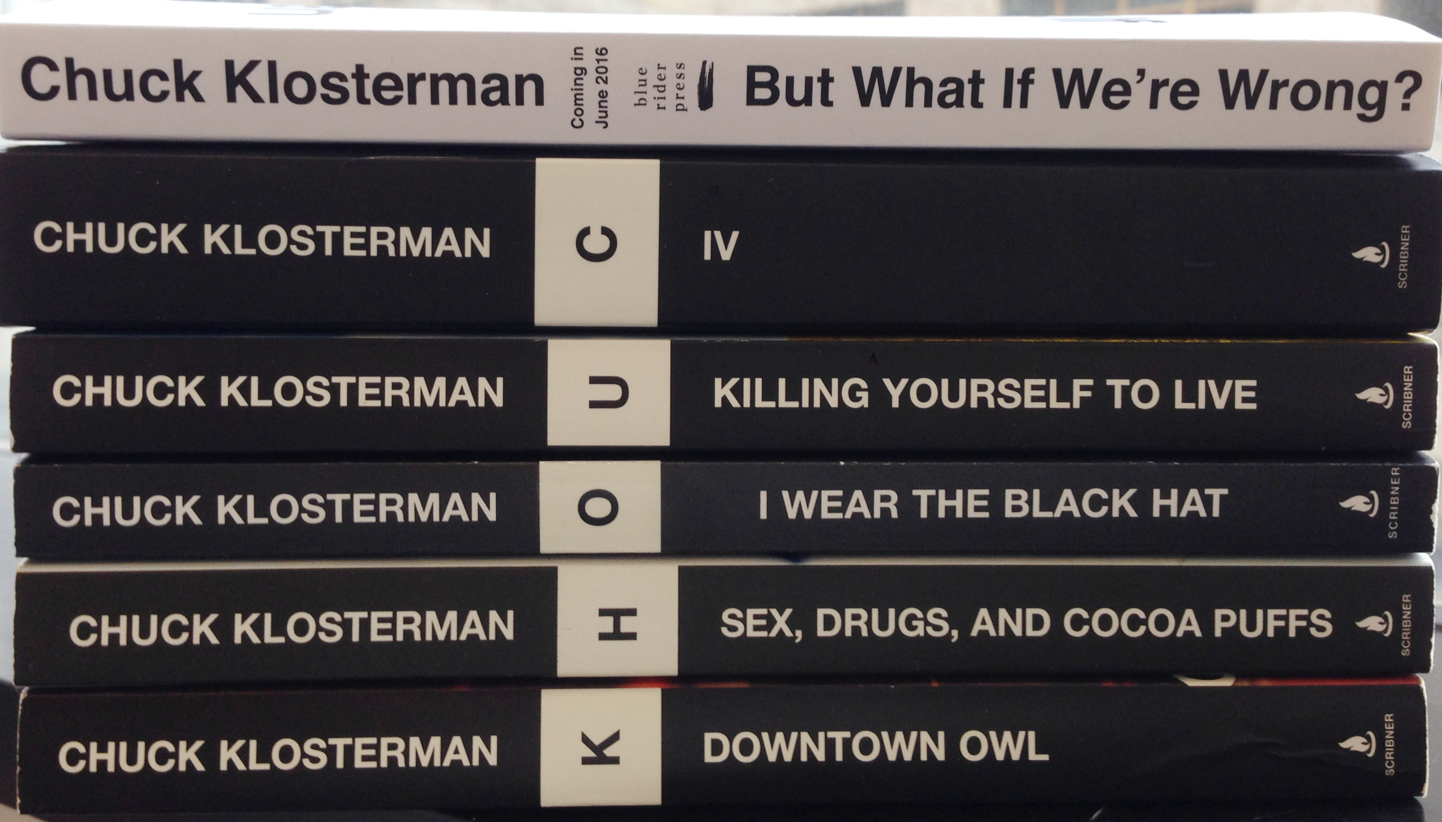 Chuck Klosterman is an author and essayist known for his books (Sex, Drugs, and Cocoa Puffs, Eating the Dinosaur, and Fargo Rock City, among others), and his columns and articles for GQ, Esquire, Grantland, Spin, and The New York Times Magazine. His newest book,
  Read more about But What If We’re Wrong? below.
 What have been some of your most rewarding achievements over the course of your career as a publisher?
Right from the beginning I wanted to publish books that made kids feel good and that made all kinds of kids feel represented. One of my early books at Viking was a picture book called I Like Me! by Nancy Carlson, about a confident pig, and I adored its message. When I became the publisher of Putnam in the mid-1990s, I signed up Jacqueline Woodson because I loved her extraordinary, lyrical voice, and I was thrilled when so many of her books won major awards. Her most recent picture book with E. B. Lewis,
What have been some of your most rewarding achievements over the course of your career as a publisher?
Right from the beginning I wanted to publish books that made kids feel good and that made all kinds of kids feel represented. One of my early books at Viking was a picture book called I Like Me! by Nancy Carlson, about a confident pig, and I adored its message. When I became the publisher of Putnam in the mid-1990s, I signed up Jacqueline Woodson because I loved her extraordinary, lyrical voice, and I was thrilled when so many of her books won major awards. Her most recent picture book with E. B. Lewis, 


