The Girl on the Train Movie Trailer Debuts

This Wednesday (4/20), Universal Pictures released the first official trailer for the highly anticipated movie adaptation of the #1 bestselling novel by Paula Hawkins, The Girl on the Train . The trailer offers a glimpse of Emily Blunt in the role of Rachel Watson as we see the dark themes of Hawkins’ psychological thriller come to life. The haunting trailer has been shared by many media outlets and continues to spread quickly across social media platforms, furthering the book’s widespread popularity. Read about the book here:  

2016 Pulitzer Prize Winners from Penguin Random House

It is the centennial year of the Pulitzer Prize and the awards have just been announced. From Penguin Random House, we are proud to publish these Pulitzer Prize winners:
  • General Non-Fiction: Joby Warrick for Black Flags: The Rise of ISIS
  • History: T.J. Stiles for Custer’s Trials: A Life on the Frontier of a New America
  • Biography or Autobiography: William Finnegan for Barbarian Days: A Surfing Life
Congratulations also to Kelly Link, whose short story collection, Get in Trouble, was a finalist for Fiction. Click through to learn about the books and find yourself an award-winning read!

Win a Trip for Two to Paris Inspired by The Little Paris Bookshop

Read it Forward is running an amazing sweepstakes! Enter for a chance to win a trip for two to Paris!

To celebrate the paperback publication of the international bestseller The Little Paris Bookshop by Nina George, we want you to experience spring in Paris!

Click here to enter before 11:59 PM (EST) on April 30th. Don’t miss your chance!

Challenge Your Shelf: Poetry Month Reading Challenge

Who said reading can’t be competitive? Every few months, we’ll be challenging you to read a list of selected books. Print out the challenge and cross the titles off as you go. Show off how much you’ve read by taking a picture and tweeting @penguinrandom or Instagramming (@penguinrandomhouse) with the hashtag #challengeyourshelf.

The Life of a Book: An interview with Sales Manager Justin Goodfellow

We’re going deep inside the making of a book, with interviews from Penguin Random House employees in editorial, marketing, sales, and more.  If you’ve ever wondered about all the behind-the-scenes work that goes into making your favorite books, this is the series for you.   Today we’re featuring our interview with Justin Goodfellow, who sells But What if We’re Wrong? to bookstores, and is here to give us a sales perspective.  What does your job entail? 

I have the great fortune of being a Sales Manager for Penguin Adult books! In this role, I present all of the upcoming titles from Penguin Books to independent bookstores in the New York metropolitan area. In other words, I’m a bookseller to booksellers! During the course of a year, I meet with various book buyers to discuss and select the titles that will eventually be on their shelves for readers to purchase. The part about these meetings that I love so much is that I get to be involved in curating the store along with the buyer. Every independent bookstore is unique, and it is my responsibility to learn as much as I can about the stores so that the books I sell them will reflect their personalities. 

I also work extensively with the other departments in publishing like editorial and publicity. Editors will often let sales people read manuscripts so that we can offer feedback or let them know about a store that will be particularly excited about the book. And then there is publicity! Publicists are dear friends to Sales Managers because we work together to setup author readings and signings at different bookstores across the whole country. In my opinion, there is no better way to spend a weekday evening than to attend a reading at your local bookshop.

When you describe But What if We’re Wrong? to bookbuyers, what is your hook? What is memorable or unique about the book? Why would they want it in their store?

You would probably laugh at how little of a hook I need for Chuck Klosterman a lot of the time! His reputation precedes him, and I often sell the book well by simply saying, “Look, it’s the new Chuck Klosterman!” But there is so much more that I get to tell my booksellers about. When it comes to But What If We’re Wrong?, I feel like Klosterman has explored a question that covers an impressive number of topics. From a conversation with Neil deGrasse Tyson about the multiverse to reasons why the NFL could potentially fail, But What If We’re Wrong? is genius in its breadth, and that is going to bring an entirely new audience to Klosterman.

There are so many different reasons for why independent bookstores love Chuck Klosterman! One thing I’ve heard that cracked me up is that many view Chuck Klosterman as a hipper Malcolm Gladwell. Now while I personally think that Gladwell is plenty hip, I also feel like I understand the deeper sentiment underneath that opinion. There is a level of access that every Klosterman book achieves, and it results in a sincere investigation about a topic. Reading Klosterman doesn’t feel like reading an author who is analyzing something from the outside; it feels like reading the carefully considered meditations of someone who is intimately involved with what they write about. That sincerity can’t be faked in a reading experience because it is simply the result of skillful writing.  

What’s your favorite thing about your job? What would surprise a layman to know?

What continues to strike me about my job is that I get to connect people who all love books. My publishing house considers me a specialist on the bookstores I work with, and in turn, my bookstores view me as a specialist about the publishers and all of the different titles we bring out. It is a singular role, and I love the opportunity to continue learning from the books and the people that participate in the world of literature.

You’re a fan of Chuck Klosterman – what do you like about his writing? What do you like about this new book? Do you have a favorite moment or line?

I love that Klosterman always feels like he is writing directly to me. It creates an experience that not many authors can bring to the page. Sometimes this occurs through those passages that directly address the reader, but more often I feel addressed by a line of thought. It’s as if a good friend of mine is laying out an issue before me with perfect pacing and allowing me to fully grasp his point of view. 

My favorite part of But What If We’re Wrong? is this amazing section about television’s ability to capture and portray a time period. The quick take away from the chapter is that while everyone might love Mad Men and think of it as crowning accomplishment that captured the 1960s, many historians of the future would probably disagree. The perceptions that created Mad Men came from people living in the early 2000s instead of the actual 1960s. Everything about Mad Men is too perfectly considered and too meticulously constructed with hindsight to be genuinely natural. Instead, a show like Roseanne offers a much more realistic portrayal of its time period. Like many families living in the 1990s, Roseanne showed a chubby American family trying to get by with okay jobs while living in a kind of messy house. For many, that is an accurate picture of life in the 1990s, and Roseanne was able to capture all of this unknowingly. The show was just created in the very same time period its characters lived in!

Read the first post in this series here, and part one and part two of the Q&A with Klosterman’s editor.

The Making of Vogue Colors A-Z Coloring Book: A Production Tale

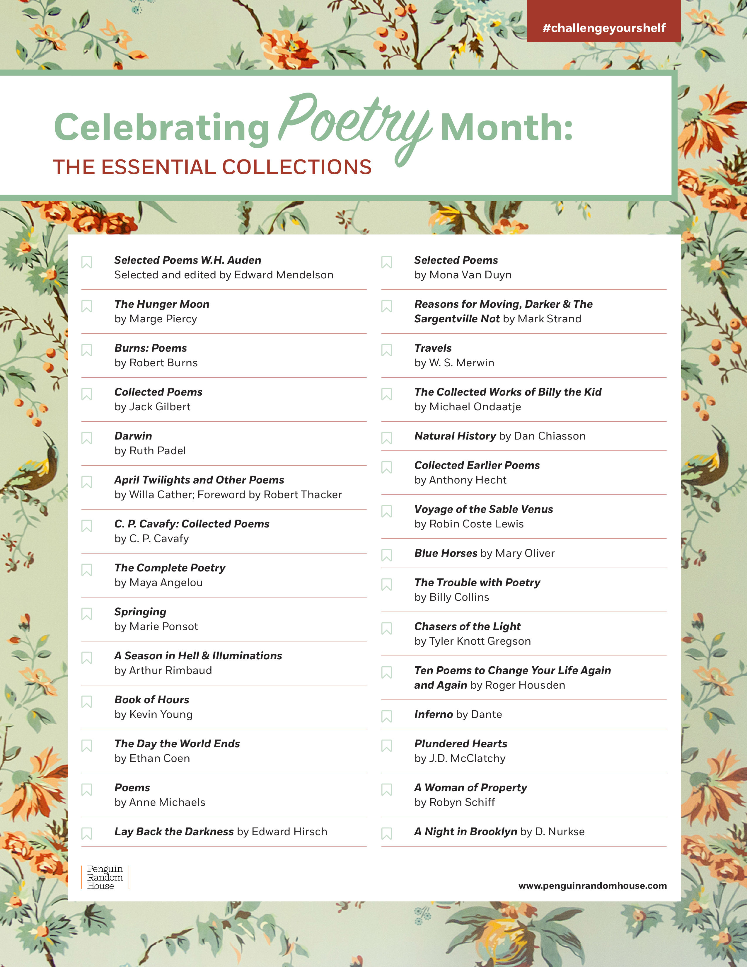
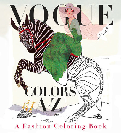
Adult coloring books have taken the world by storm. Here, Andy Hughes, (Vice President and Director of Production and Interior Design, Knopf Doubleday Publishing Group) takes us behind the scenes of the new Vogue Colors A-Z. The Vogue coloring book is my first foray into the making of what’s become a publishing phenomenon. I’ve been producing books for Alfred A. Knopf publishing for nearly 40 years, during which time, I’ve handled every genre of book, including massive, sumptuous coffee table Vogue books (Vogue Living, World of Vogue, Vogue Weddings), so I welcomed the opportunity and challenge to figure out how to put together a typically lower-priced interactive consumer book coupled with the prestige of the Vogue brand. 
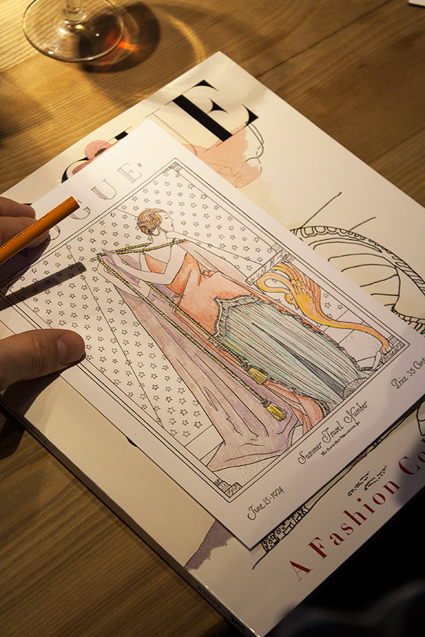
When the idea was introduced to me in December 2015, it was soon apparent that reconstructing full-color vintage Vogue cover images into outline form would be a difficult challenge. Valerie Steiker, the Vogue Editor who conceived and assembled the project, sent Knopf’s editor, Shelley Wanger, four sample images at my request for testing. The alphabetical architecture of the book meant 26 images; when I studied them all, some of the covers were rendered simply with large mono-colored elements, others with the shadowing of garments with folds or the translucency of a diaphanous silky material, and the rest elaborated with rich details of texture and pattern. The goal of retaining the readability of the images, without the assistance of color, shading, and texture, was my immediate concern and challenge to figure out. The first task was to de-colorize the image and delete the tonal gradations of the art. I had a pre-press vendor handle this in Photoshop, instructing them to retain as much of the skeletal outlines of the images as possible. But, the resulting image file retained just a soft, fuzzy outline, and many of the details got diminished in this filtering process. It was apparent that the services of an artist-illustrator would be needed to re-draw the art to enhance the line and embellish the image to suggest volume and delineate areas of detail for the colorist to fill in. A young, fashionable colleague of mine suggested her aunt, Cecilia Lehar, who did just this sort of inking. So, I wrote Cecilia, who years ago had coincidentally worked on Vogue patterns for 11 years, and worked on an exhibition, 250 years of Fashion, for the Philadelphia Museum of Art. I reviewed her portfolio, and asked her to prepare a line art version of the four pieces I had de-colorized. Her initial work was excellent: faithful to the original, yet now as a line rendering that could be successfully filled in with colors. 
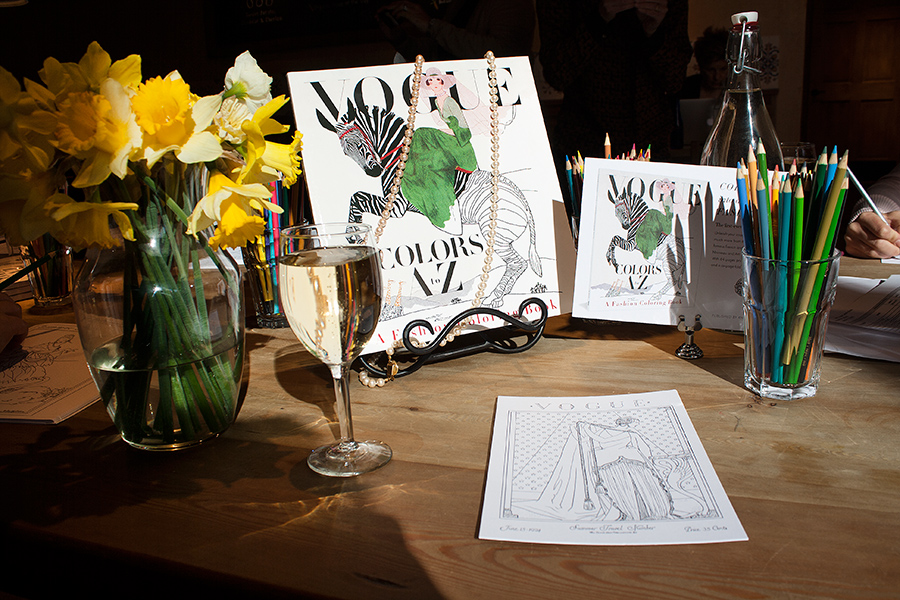
From that moment on, for the next month, it was meetings at Vogue and in my office to review the ensuing progress of Cecilia’s re-work of all the illustrated covers and incidental art throughout. In the book, each cover appears on the right side page of a spread, faced on the left page with the letter of the alphabet that corresponds to some element or theme of the cover image. Initially, the Vogue Deputy Design Director, Alberto Orta, chose a period-appropriate “Deco” border motif surrounding the letter of the alphabet, dramatic with contrasting black and white panels. We realized quickly that any solid filled-in area needed to be “emptied” to only an outline so another element of the book could be filled in with color by the book’s owner. And, each letter is further decorated by drawings evocative of the letter and cover image, which also needed to be re-drawn as line art. So, as the book took form, we added more and more colorable areas. The book also includes a six-page barrel gatefold insert, perforated for removal from the book, comprised of 21 appareled models, consecutively arranged, representing the years 1912-1932. Again, each figure required re-drawing and refinements making them suitable for coloring. The cover of this paperback book features six-inch flaps (more figures to color!), and printed on the verso side of the cover, an array of the same decorative drawings that punctuate each letter within the book. Manufacturing a book equal to the quality of Vogue’s historical covers required extensive research to identify the ideal paper to print on. The paper’s brightness, opacity and surface smoothness were all considered carefully, and finally, a 120-pound text (aka 65-pound cover) Accent Opaque paper was deemed perfect, but the next challenge was to make sure paper this thick could be folded well on the press equipment available for the large quantity of books being printed and the tight schedule we were dealing with. Press tests were conducted—luckily successful—though pushing at the limits of the equipment’s capabilities. Another embellishment to the book was including thumbnail-sized reproductions of the original covers (color elements are very uncommon in coloring books). Their reproduction was critical, and including these references of the original art allowed Valerie the opportunity to identify the cover images’ creators along with fascinating anecdotes, which further elevates Vogue Color A-Z above other coloring books by adding fashion history, wit, and a challenge to this book’s colorist to match the original artwork. Read below to learn more about the book!

From the Editor’s Desk: Jake Morrissey, Executive Editor, on Three-Martini Lunch by Suzanne Rindell

Editors get very passionate about books they work on – the Editor’s Desk series is his or her place to write in-depth about what makes a certain title special. Get the real inside-scoop on how books are shaped by the people who know them best. The best present an author can give an editor is the gift of surprise. Editors spend their days reading a lot of manuscripts that don’t tell them anything new. So reading a story about a world you thought you understood framed in an unexpected way that prompts you to think differently about it, that’s hitting the publishing jackpot. Which is what I did when Three-Martini Lunch came across my desk. In this terrific novel, Suzanne Rindell delves into a world I knew something about – book publishing – but sets her story in the late 1950s, which was when big changes were about to take place. I thought I had a decent grasp of the era. I’m familiar with two other iconic New York stories from around that time: Rona Jaffe’s classic novel (and eventual movie) The Best of Everything and the television show Mad Men. In both of those, New York City is portrayed as one of the places to be in the mid-20th century. If you know anything about either The Best of Everything or Mad Men – or even Alfred Hitchcock’s 1959 movie North by Northwest – you see a New York that’s sleeker, cleaner, less crowded than it is today. And the roles of men and women were as clearly defined then as their ambitions: Success for men meant career and advancement; success for women marriage and family. In Three-Martini Lunch, Suzanne Rindell peers beyond that mid-century mindset and explores the lives and worlds of Miles, Cliff and Eden, three young people struggling to gain a toehold in New York and hoping that publishing is the way to do that. The lives they lead are a far cry from the expense-account lunches and pristine suburban enclaves of the publishing elite. These young people are drawn to Greenwich Village and its emerging beatnik culture, with its dark and smoke-filled bars, jazz clubs, and poetry readings. And they struggle to stretch their meager bank balances by living in cramped, ramshackle apartments and having just enough money for food and beer but not always both. Suzanne gives her characters fascinating opportunities to pursue their individual ambitions and indulge their temptations. Even more compelling, she shows readers how the choices they make to achieve their goals changes them. I’m not giving anything away when I say that what you think of Miles, Cliff, and Eden at the beginning of Three-Martini Lunch will not be what you think of them at the end. As I followed the characters’ journeys through successive drafts of the novel, I found myself reassessing my own ideas about what was possible in publishing, in New York, and in America during that time. It was an era on the cusp of upheaval and turmoil, and it’s that change that Suzanne Rindell explores so effectively – and so surprisingly – in Three-Martini Lunch. Which is one of the highest compliments I can pay. Learn more about Three-Martini Lunch below!