Stephanie Moss: The interior design process is very collaborative and we work closely with the authors. When the manuscript is submitted to editorial, the authors also share art, design notes and reference material for the different types of pages throughout the book. Our first task is to then flesh out those ideas into the designs for the pages that appear most frequently. Afterward, we’ll focus on the more unique pages throughout the book. These pages often involve partnering with talented illustrators, like Marie Lu, Meinart and Stuart Wade, to create Hanna’s diary pages and the ship schematics and logos. Each set of designs is then shared with the editor and authors where we’ll discuss possible changes and finesse each idea until it best captures the vision for the book. After the main pages are approved, we’ll begin bringing all the different components together and lay out the entire book. This is also the time when we fine tune some of the one-off page designs.
Ray Shappell: Yes, indeed. The Illuminae Files are ultimately their brainchild, so our goal in designing the series was to enhance their unique storytelling with a one-of-a-kind package. This series is more technically complicated than any other, and requires a huge collaboration with everyone involved. Once editorial and design approve a cover, we share it with the authors and value their opinions through each step of the process.
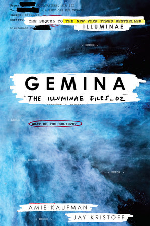
Creating the cover for Gemina was actually a breeze, compared to the process for Illuminae, because I already had an established series design. When I start a new series, I always think about how the current design would work for a second and third book. (Or more if we’re lucky.) So when we finally nailed down the concept for book 1 in The Illuminae Files—a brightly colored explosion interacting with the redacted documents from the story through acetate and a printed case—I also had a rough proposal for Gemina and the third book in the series. When Jay and Amie were in the offices celebrating Illuminae’s launch last November, I shared the proposed visuals for Gemina and they loved it!!! Coincidentally, the color of the blue explosion fits perfectly with the description of a black hole in Gemina. And the proposed image for book three is…XXXXXXXXX (redacted).
 What is your favorite part of your job?
Ray Shappell: My favorite part of the job is creative problem solving. After reading the manuscript, I have so many concepts and design ideas. I love sketching them all out—picking out typefaces, colors, textures, illustrations, hand lettering, or hiring an illustrator, photographer, or CG artists—all to match the tone of the story. But since I’m not the only one involved, there will be multiple moments throughout the cover design process that require finding a new solution that addresses the needs and concerns of everyone involved, while maintaining creative integrity of the original concept and design. This is extremely fun and rewarding when you are able to make a final piece of artwork that becomes the book jacket. The Illuminae Files is a great example of this working at it’s best – the end product is a much better version of the original concept.
Stephanie Moss: The best part of my job is collaborating with a lot of talented people. Particularly with Gemina, it was exciting to pull together everyone’s ideas then work with artists and a wonderful designer, Heather Kelly, and see those ideas get interpreted in really neat ways.
What would surprise a layman to know about your work?
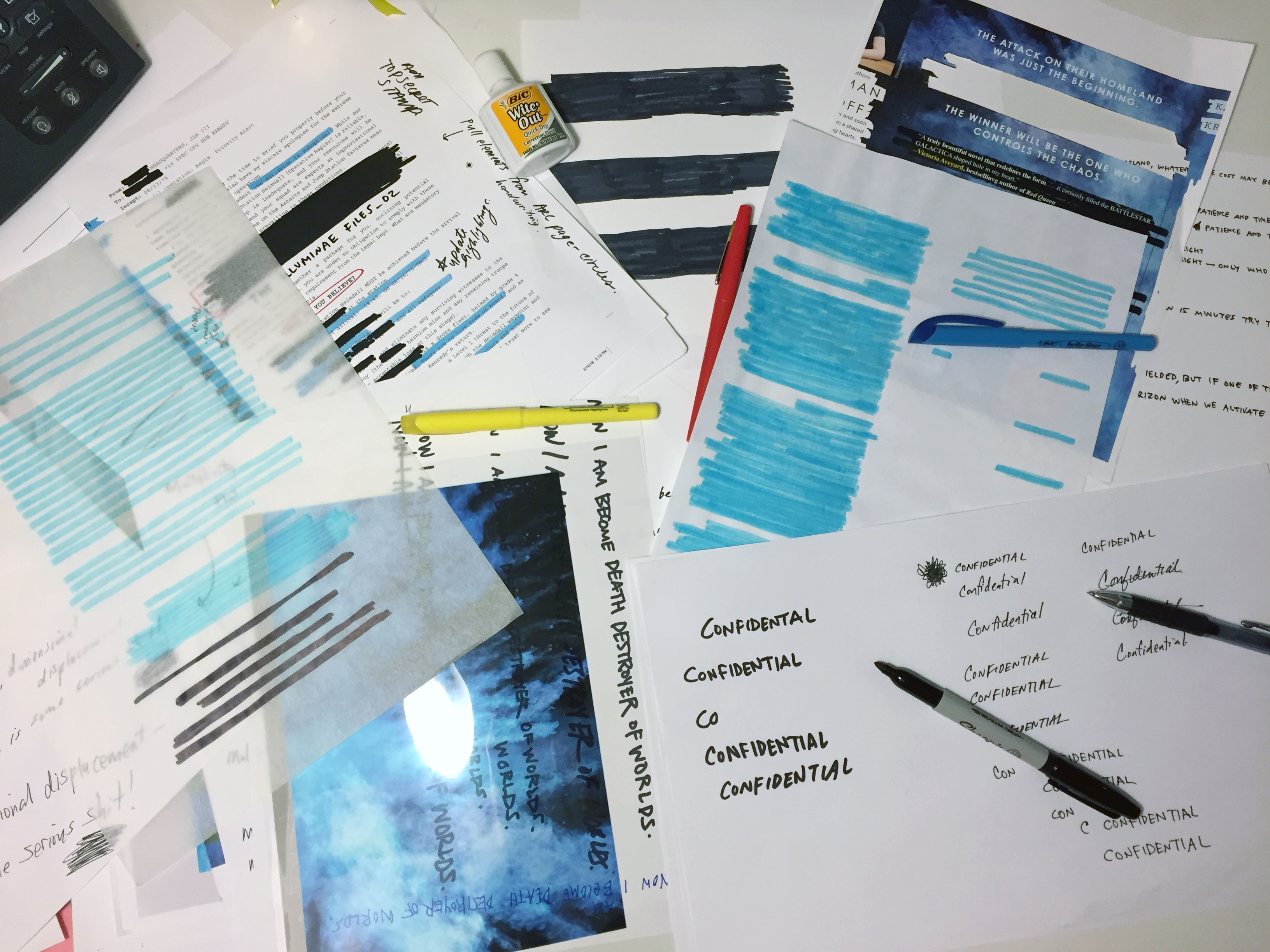
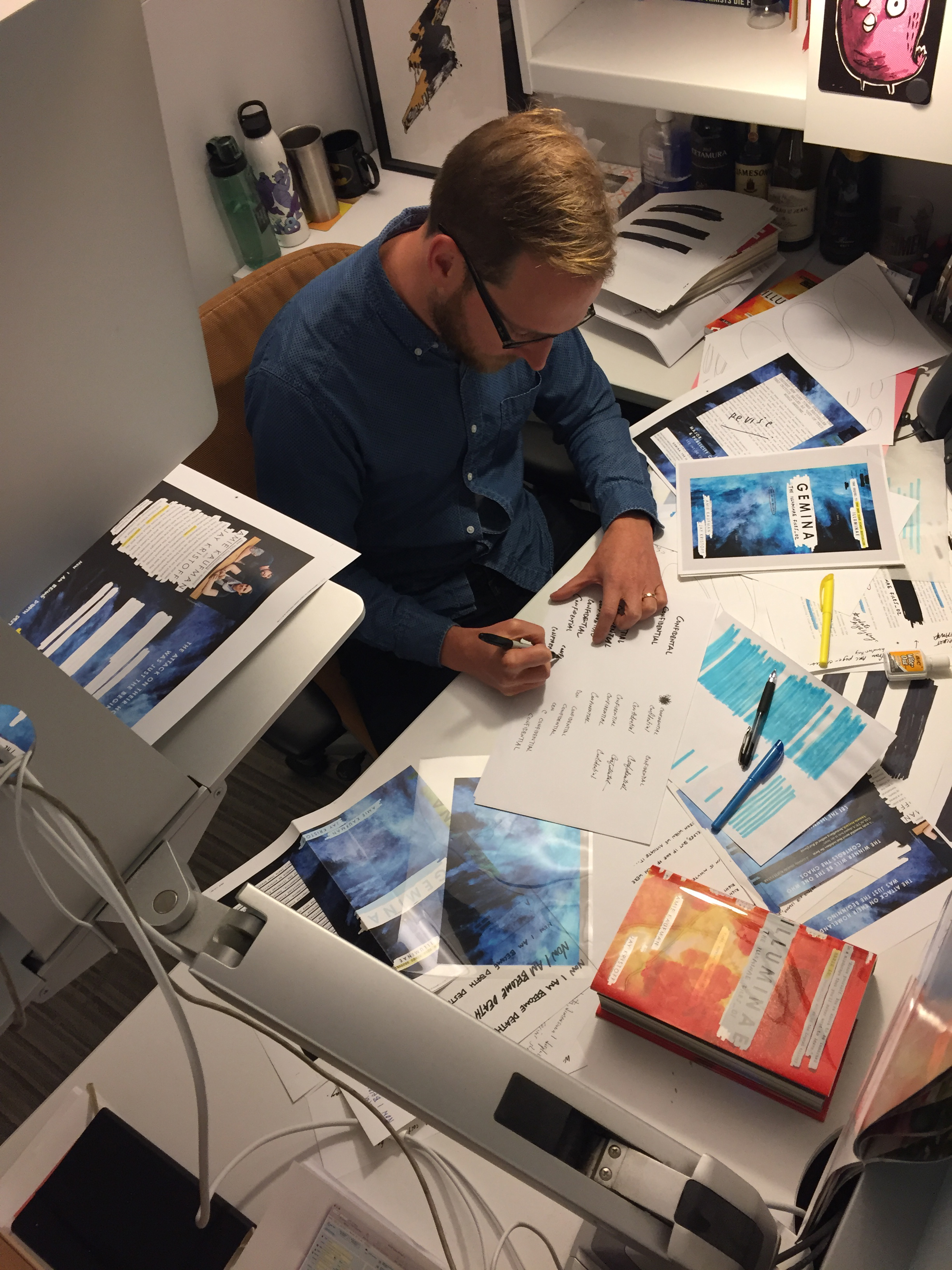
Ray Shappell: I love keeping physical authenticity of design over digital effects when possible. So in the case of Gemina, I actually set the files up clean on the computer first. However, once copy is approved, I then print out the covers and take a bunch of Sharpie markers, highlighters and tracing paper over to a light box. I cross out everything, scribble over the redacted areas, and make it messy. Then I scan it back into the computer and continue to line up all if the sharpie marks over the type on a different layer. I think it looks more realistic than if I used a digital marker.

What did you most want this one to convey?
Ray Shappell: I think that a successful jacket does a few things:
- It intrigues you and draws you in, making you pick it up and want to learn more about the story.
- It has great design (visual balance of graphic elements, typography, artwork, color, etc.)
- It stands out from the competition in a new and fresh way
- It informs you about the content from a very quick glance.
For The Illuminae series, our goal was to portray as much of the interior as we could on the cover, since it’s such a creative and unique story telling experience. Using the acetate to reveal and redact text from the case underneath was our solution for showing pieces of the story—with layers of actual text and phrases—in a new and exciting manner. I hope you enjoy the secret messages that are printed in the negative of the opaque white ink!
How has your approach to designing covers changed over time?
Ray Shappell: I’m hoping to push what’s possible in our YA market. I know how to make covers that will be liked and approved easily. But I prefer the challenge to create covers that push the limits of what we have seen before. Yes, they may require extra convincing and more energy, but the end result is a cover that really stands out from the rest.
I also have been incorporating more technology into my designs. I’ve created animated gif covers for Illuminae and Gemina, but I just finished working with a CG studio to create a fully animated cover for an upcoming series. Along with an augmented reality app, it brings the print book to life! It’s AMAZING and should be out shortly!!

Follow the authors on Twitter (@AmieKaufman, @misterkristoff) and Instagram (@amiekaufmanauthor, @misterkristoff)
Visit the website here: illuminaefiles.com



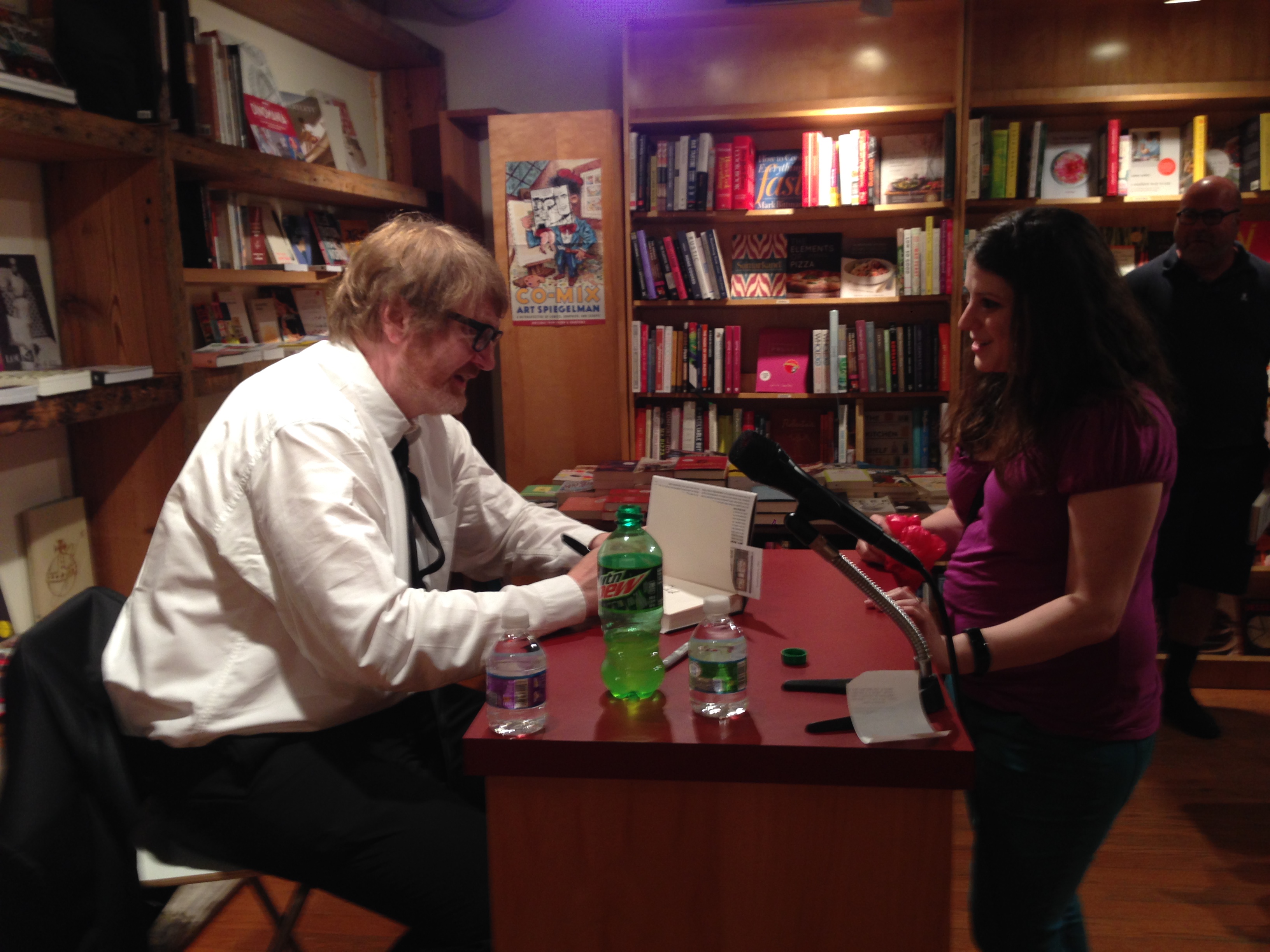
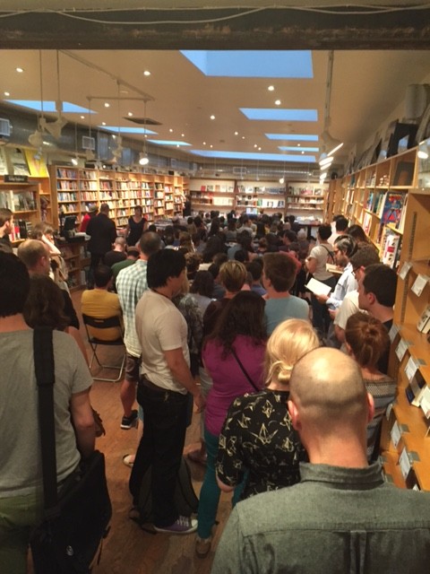
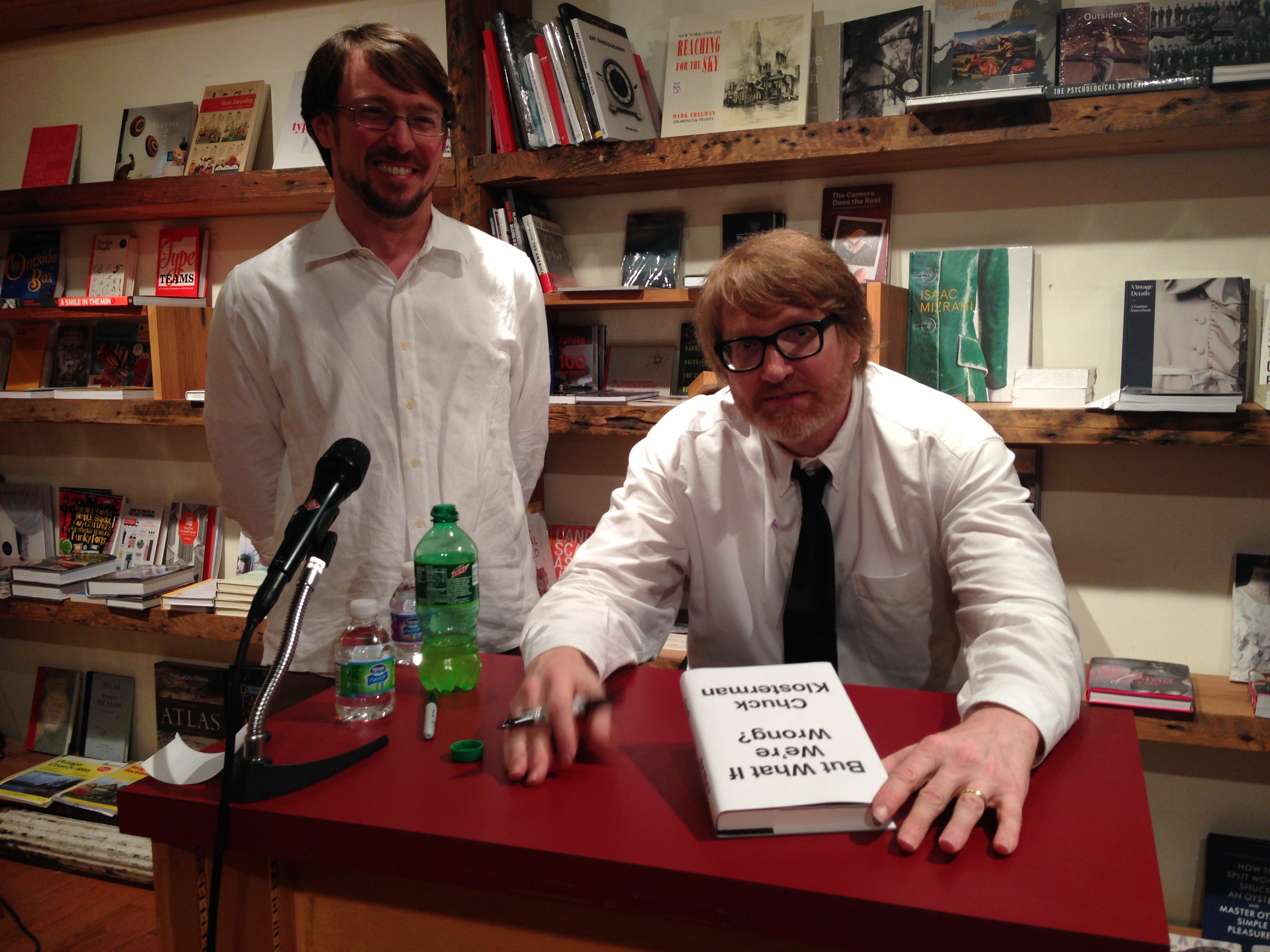
 Chuck read from his book and signed copies for fans… and it was a packed house!
 Today we’re featuring an interview with Andrew Unger, events and publicity manager of Brooklyn bookstore, BookCourt.
What is your job title, and what does that mean? What’s your day to day? What would surprise a layman to know?
I am the events and publicity manager. My daily schedule is varied and unpredictable, but focuses primarily on acting as the voice and public face of BookCourt. I manage our
  When you order books from a publishing company, what do you consider? What makes a book attractive to you and your customers?
We have store bestseller list at the front. This list features the bestselling books from the previous week. Consistently, these books reflect the same taste as reviewers for the New York Times, the New Yorker, and the New York Review of Books. Our customers prefer something sophisticated and intellectually stimulating. Proud as all of us are of our libraries, there’s just no escaping a good cover. Many bad books have been sold through good cover designs and, far and away, too many great books have been relegated to a dusty corner of the shelf because of an ill-advised cover. Occasionally, a truly great book will arrive in the store.




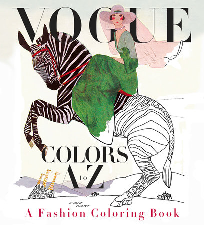
 When the idea was introduced to me in December 2015, it was soon apparent that reconstructing full-color vintage Vogue cover images into outline form would be a difficult challenge. Valerie Steiker, the Vogue Editor who conceived and assembled the project, sent Knopf’s editor, Shelley Wanger, four sample images at my request for testing. The alphabetical architecture of the book meant 26 images; when I studied them all, some of the covers were rendered simply with large mono-colored elements, others with the shadowing of garments with folds or the translucency of a diaphanous silky material, and the rest elaborated with rich details of texture and pattern. The goal of retaining the readability of the images, without the assistance of color, shading, and texture, was my immediate concern and challenge to figure out.
The first task was to de-colorize the image and delete the tonal gradations of the art. I had a pre-press vendor handle this in Photoshop, instructing them to retain as much of the skeletal outlines of the images as possible. But, the resulting image file retained just a soft, fuzzy outline, and many of the details got diminished in this filtering process. It was apparent that the services of an artist-illustrator would be needed to re-draw the art to enhance the line and embellish the image to suggest volume and delineate areas of detail for the colorist to fill in. A young, fashionable colleague of mine suggested her aunt, Cecilia Lehar, who did just this sort of inking. So, I wrote Cecilia, who years ago had coincidentally worked on Vogue patterns for 11 years, and worked on an exhibition, 250 years of Fashion, for the Philadelphia Museum of Art. I reviewed her portfolio, and asked her to prepare a line art version of the four pieces I had de-colorized. Her initial work was excellent: faithful to the original, yet now as a line rendering that could be successfully filled in with colors.
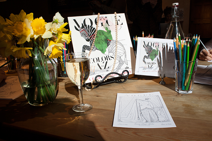 From that moment on, for the next month, it was meetings at Vogue and in my office to review the ensuing progress of Cecilia’s re-work of all the illustrated covers and incidental art throughout. In the book, each cover appears on the right side page of a spread, faced on the left page with the letter of the alphabet that corresponds to some element or theme of the cover image. Initially, the Vogue Deputy Design Director, Alberto Orta, chose a period-appropriate “Deco” border motif surrounding the letter of the alphabet, dramatic with contrasting black and white panels. We realized quickly that any solid filled-in area needed to be “emptied” to only an outline so another element of the book could be filled in with color by the book’s owner. And, each letter is further decorated by drawings evocative of the letter and cover image, which also needed to be re-drawn as line art. So, as the book took form, we added more and more colorable areas.
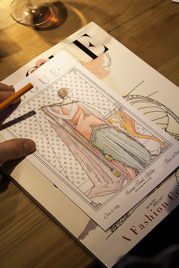 The book also includes a six-page barrel gatefold insert, perforated for removal from the book, comprised of 21 appareled models, consecutively arranged, representing the years 1912-1932. Again, each figure required re-drawing and refinements making them suitable for coloring. The cover of this paperback book features six-inch flaps (more figures to color!), and printed on the verso side of the cover, an array of the same decorative drawings that punctuate each letter within the book.
Manufacturing a book equal to the quality of Vogue’s historical covers required extensive research to identify the ideal paper to print on. The paper’s brightness, opacity and surface smoothness were all considered carefully, and finally, a 120-pound text (aka 65-pound cover) Accent Opaque paper was deemed perfect, but the next challenge was to make sure paper this thick could be folded well on the press equipment available for the large quantity of books being printed and the tight schedule we were dealing with. Press tests were conducted—luckily successful—though pushing at the limits of the equipment’s capabilities. Another embellishment to the book was including thumbnail-sized reproductions of the original covers (color elements are very uncommon in coloring books). Their reproduction was critical, and including these references of the original art allowed Valerie the opportunity to identify the cover images’ creators along with fascinating anecdotes, which further elevates
 These past five weeks at Random House have been really educational and productive. I am interning in the Advertising/Promotions department, as well as the Art/Design department for the Random House Publishing Group imprint. Even on my first day I could tell that this was going to be a valuable experience that I would enjoy. Being an intern can be intimidating, but this is not the case at Random House. Everyone who works here is extremely humble, and friendly, and is eager to teach beginners the works of the business. It is an environment where teamwork is fostered, and the success of books is priority.
In the Art department I am being supervised by Paolo Pepe, the SVP & Creative Director. I have been reading manuscripts and learning how to design book covers using Adobe Creative Suite and hand illustration. This process has been really challenging because everyone involved in the process has a very specific image of how they think the cover should look. One book that I am working on has been in the cover development process for almost a year. It has been really interesting learning about the process from such talented designers, as well seeing the selection process from the publisher’s point of view. For the art department, I’ve also been creating mechanicals using Adobe Creative Suite, and creating templates for e-books.
In the Advertising and Promotions Department, I am being supervised by the Sr Director of Creative Services, Annette Melvin. For the department I have been using Adobe Creative Suite to create advertising materials for upcoming books, such as social media banners, and print ads. I’ve also been writing copy for upcoming book’s advertising campaigns.


