Camille Aubray joins Amy to talk about her book, COOKING FOR PICASSO, which follows a young woman whose life changes when she spends a summer cooking for Picasso. They cover provençal cuisine, writing in the south of France, and Picasso’s many love affairs.
We’re going deep inside the making of a book, with interviews from Penguin Random House employees. Take a look at the first post in this series here. You can preorder the book here. For a Q&A with the authors, click here… and for you superfans, join First In Line here to see the full uncensored version. Follow along: #Gemina, #Illuminae, #IluminaeFiles
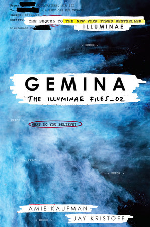
Gemina is a beautifully and complicatedly designed book. We spoke to Ray Shappell, Senior Designer at Random House Books for Young Readers and Stephanie Moss, Art Director at Penguin Random House, to find out more. Did you interact with the authors when planning your design?
Stephanie Moss: The interior design process is very collaborative and we work closely with the authors. When the manuscript is submitted to editorial, the authors also share art, design notes and reference material for the different types of pages throughout the book. Our first task is to then flesh out those ideas into the designs for the pages that appear most frequently. Afterward, we’ll focus on the more unique pages throughout the book. These pages often involve partnering with talented illustrators, like Marie Lu, Meinart and Stuart Wade, to create Hanna’s diary pages and the ship schematics and logos. Each set of designs is then shared with the editor and authors where we’ll discuss possible changes and finesse each idea until it best captures the vision for the book. After the main pages are approved, we’ll begin bringing all the different components together and lay out the entire book. This is also the time when we fine tune some of the one-off page designs.
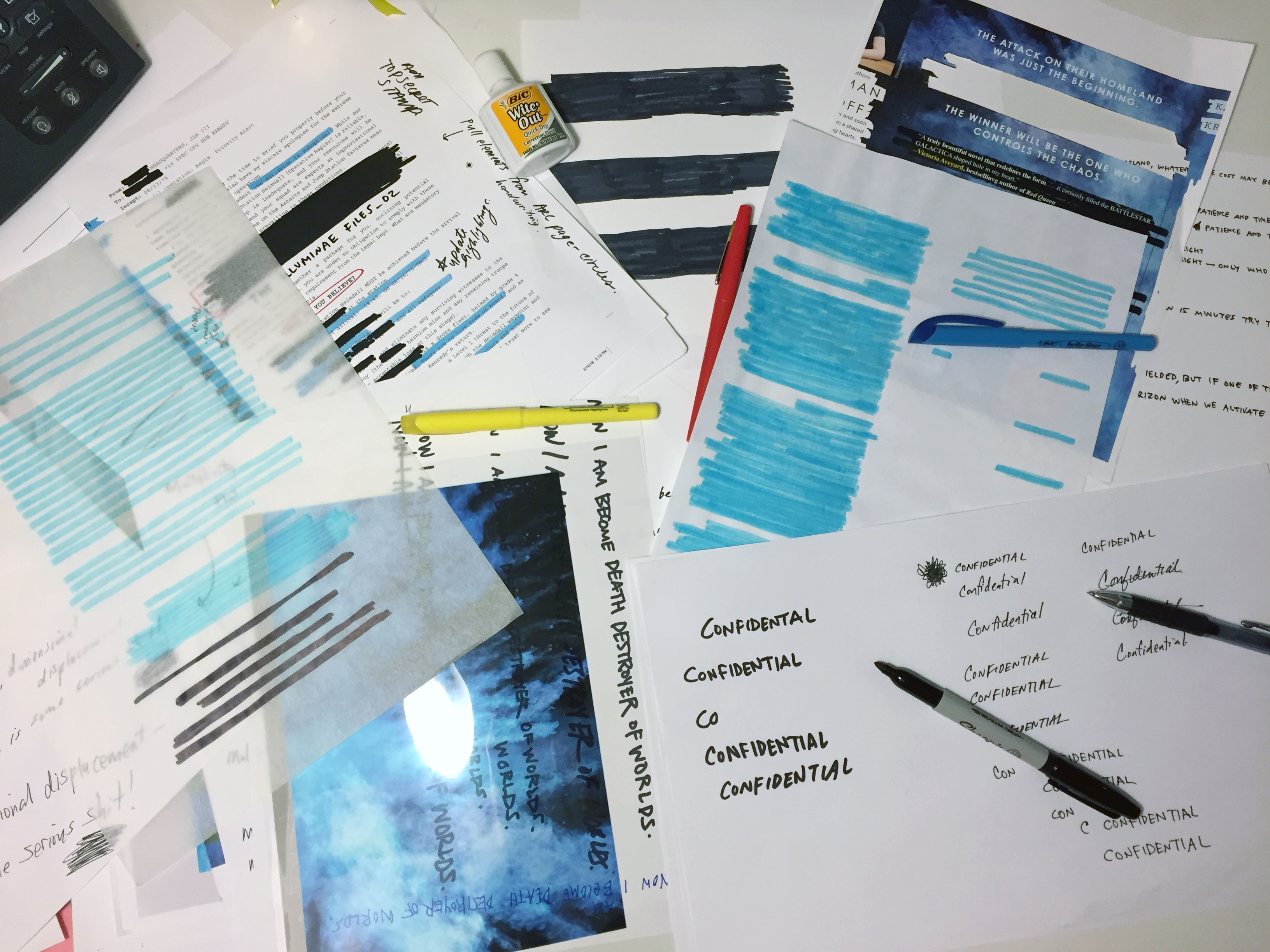
Ray’s Gemina supplies
Ray Shappell: Yes, indeed. The Illuminae Files are ultimately their brainchild, so our goal in designing the series was to enhance their unique storytelling with a one-of-a-kind package. This series is more technically complicated than any other, and requires a huge collaboration with everyone involved. Once editorial and design approve a cover, we share it with the authors and value their opinions through each step of the process.
Creating the cover for Gemina was actually a breeze, compared to theprocess for Illuminae, because I already had an established series design. When I start a new series, I always think about how the current design would work for a second and third book. (Or more if we’re lucky.) So when we finally nailed down the concept for book 1 in The Illuminae Files—a brightly colored explosion interacting with the redacted documents from the story through acetate and a printed case—I also had a rough proposal for Gemina and the third book in the series. When Jay and Amie were in the offices celebrating Illuminae’s launch last November, I shared the proposed visuals for Gemina and they loved it!!! Coincidentally, the color of the blue explosion fits perfectly with the description of a black hole in Gemina. And the proposed image for book three is…XXXXXXXXX (redacted).
What is your favorite part of your job?
Ray Shappell: My favorite part of the job is creative problem solving. After reading the manuscript, I have so many concepts and design ideas. I love sketching them all out—picking out typefaces, colors, textures, illustrations, hand lettering, or hiring an illustrator, photographer, or CG artists—all to match the tone of the story. But since I’m not the only one involved, there will be multiple moments throughout the cover design process that require finding a new solution that addresses the needs and concerns of everyone involved, while maintaining creative integrity of the original concept and design. This is extremely fun and rewarding when you are able to make a final piece of artwork that becomes the book jacket. The Illuminae Files is a great example of this working at it’s best – the end product is a much better version of the original concept.
Stephanie Moss: The best part of my job is collaborating with a lot of talented people. Particularly with Gemina, it was exciting to pull together everyone’s ideas then work with artists and a wonderful designer, Heather Kelly, and see those ideas get interpreted in really neat ways.
What would surprise a layman to know about your work?
Ray Shappell: I love keeping physical authenticity of design over digital effects when possible. So in the case of Gemina, I actually set the files up clean on the computer first. However, once copy is approved, I then print out the covers and take a bunch of Sharpie markers, highlighters and tracing paper over to a light box. I cross out everything, scribble over the redacted areas, and make it messy. Then I scan it back into the computer and continue to line up all if the sharpie marks over the type on a different layer. I think it looks more realistic than if I used a digital marker.
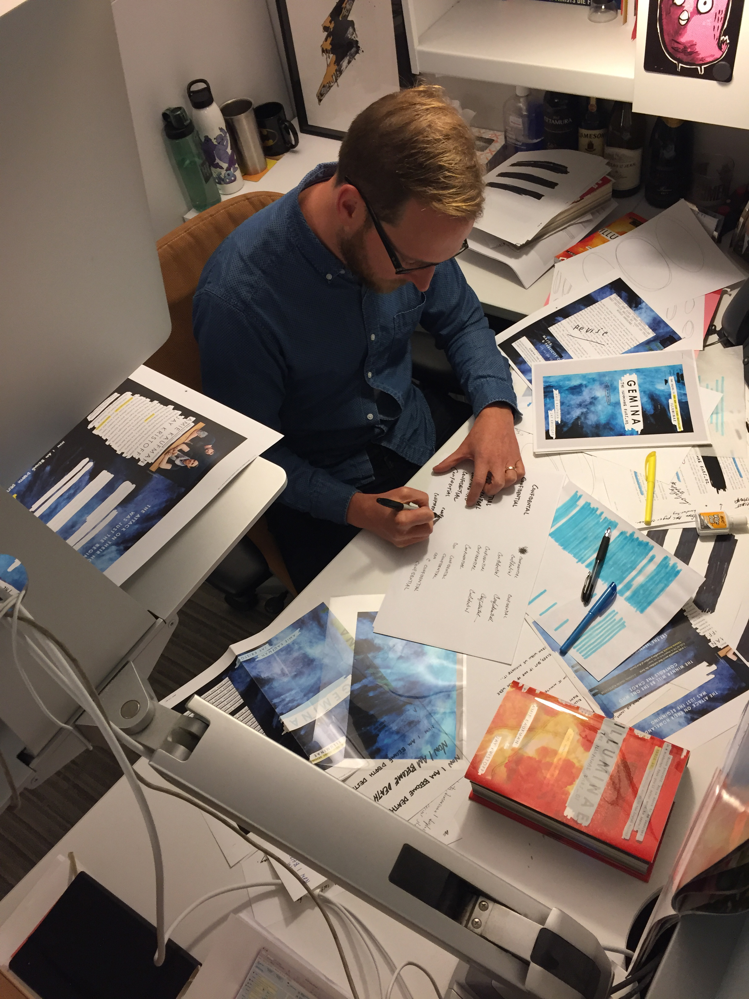
Ray Shappell at work
What did you most want this one to convey?
Ray Shappell: I think that a successful jacket does a few things:
It intrigues you and draws you in, making you pick it up and want to learn more about the story.
It has great design (visual balance of graphic elements, typography, artwork, color, etc.)
It stands out from the competition in a new and fresh way
It informs you about the content from a very quick glance.
For The Illuminae series, our goal was to portray as much of the interior as we could on the cover, since it’s such a creative and unique story telling experience. Using the acetate to reveal and redact text from the case underneath was our solution for showing pieces of the story—with layers of actual text and phrases—in a new and exciting manner. I hope you enjoy the secret messages that are printed in the negative of the opaque white ink!
How has your approach to designing covers changed over time?
Ray Shappell: I’m hoping to push what’s possible in our YA market. I know how to make covers that will be liked and approved easily. But I prefer the challenge to create covers that push the limits of what we have seen before. Yes, they may require extra convincing and more energy, but the end result is a cover that really stands out from the rest.
I also have been incorporating more technology into my designs. I’ve created animated gif covers for Illuminae and Gemina, but I just finished working with a CG studio to create a fully animated cover for an upcoming series. Along with an augmented reality app, it brings the print book to life! It’s AMAZING and should be out shortly!!
Sophia Amoruso, the New York Times–bestselling author of #GIRLBOSS and Nasty Gal founder, is back with a beautiful, ambitious book. We spoke to Kerri Kolen, the editor, to find out how an art book like this gets made:
The book is so distinct in look and feel – what made you zero in on this style and vibe?
Like any book, some of the style and vibe came along organically as the book morphed from an idea to a real book. But we always knew we wanted the book to be unlike anything else out there. There are so many other coffee table books, style books, photography books, fashion/lifestyle books. Sophia really wanted this to be its own thing—not like any of those but a mashup that more appropriately reflected the inspiration that she sees in the world—as she has experienced it. It was also important to both of us to include the essays—in the midst of all the style, there are real nuggets of wisdom and hilarity that Sophia wanted to express but that didn’t have a real place in her previous book, #GIRLBOSS.
How would you describe your collaborative process with Sophia?
The conversation is very open and fluid but also traditional in a lot of ways. For this book, we brainstormed the larger goals, overarching look and feel, and pulled inspiration together and discussed it all in very broad terms. Then Sophia went off and started collecting and creating the pieces of the book. We had a live working document in Google that we both had access to. Sophia would work on it pretty much daily and I would go in every few weeks at the beginning and make comments, notes, ask questions, make suggestions, etc. In this way, the book and its contents kept changing. Once the content felt mostly in place, we started doing the same thing with editing and making final selections, reordering, finding new images and replacing some images, etc. Eventually it felt finished enough to move to a “working manuscript.” Once we had this in place, we would each go off on our own to make notes and then get on the phone to go through the whole book—page by page—discussing our notes in detail, until the next round. We did this until there were no more notes…which was pretty much right up until the end.
With so many photos, designs, letters, and more, what was the biggest challenge in making this book?
Editing! There were so many great individual pieces that felt worthy of inclusion so the weeding out process felt a little grueling sometimes, though necessary. Plus, every time one design element changes, the whole book changes, and needs to be looked at again as a whole.
What’s your favorite piece of advice in this book?
There is so much great advice in this book. Sophia is terrific at packing a lot of wisdom in her own pithy anecdote. The essays in Nasty Galaxy are small but pack a lot of punch. I think my favorite piece of advice, though, is in the essay “On Fear”: “Get attached. Stay attached. Just don’t forget to keep evolving.” I also like her instructions for How to Check Out of a Fancy Hotel because I couldn’t agree more. Why do people still go through a formal check-out process?
What is your horoscope according to Nasty Galaxy?
Apparently I am an “intense mother*cker,”: really good at getting people on my side and have some jealous tendencies. I’d say it’s all true.
What would surprise readers to know about the making of this book?
It was harder to write and edit than #GIRLBOSS!
Find out more about this beautiful and unique book here:
Johanna Basford, the hugely popular illustrator behind adult coloring books, joins Amy to talk about the personal inspirations behind her art, fan tattoos, and more.
Learn about the book here:
Editors get very passionate about books they work on – the Editor’s Desk series is his or her place to write in-depth about what makes a certain title special. Get the real inside-scoop on how books are shaped by the people who know them best.
Meg Leder, Executive Editor, Penguin Books, takes us inside the world of adult coloring books, one of the hottest segments in publishing. She edits “The Queen of Coloring,”Johanna Basford, whose newest title, Magical Jungle, is published by Penguin Books on August 9.
In your view, what accounts for the adult coloring book craze and what separates Johanna Basford from the adult coloring book artist pack?
I think the adult coloring book craze has taken hold for several reasons: (1) It’s a welcome respite from the world of computer screens. Coloring is a distinctly physical activity, and there’s something imminently relaxing about putting marker or colored pencil to paper, instead of spending time with screens. (2) It’s an inherently democratic hobby. All you need is a book and a coloring tool—you don’t need to spend a lot of money on supplies or time learning skills. (3) And I think it speaks to something a lot of us did when we were kids—we loved it then, so it makes sense we’d love it now, especially with the more intricate designs!
I think New York Magazine dubbed Johanna the “Queen of Coloring” for a number of reasons. She was one of the first people out there to invite adults into the coloring book realm. She’s got a marvelous artistic vision—she’s so exceptionally talented at creating intricate work that inspires colorists. And she’s also extremely generous, both as a person and as a creator. She’s said a number of times that she just starts the masterpieces, and her fans finish them. I think that generosity shows in her art and resonates with all her fans.
Watch Joanna Basford’s “Magical Jungle – An Inky Expedition & Coloring Book” video:How did you come to acquire and edit your first adult coloring book and how did the process compare with how you work with Johanna on her books?
When I was at Perigee, I acquired my first two coloring books at roughly the same time: Outside the Lines by Souris Hong, and Color Me Girl Grushby Mel Elliott. Rather than the fact that they were coloring books, what drew me to both of these was the subject matter (street art and Ryan Gosling, respectively!) and the fact that they expanded notions of creativity. And then, luckily, they both really benefitted from the adult coloring book craze timing-wise.
In the years since, the coloring book audience has become a lot more opinionated and sophisticated about what they want in a coloring book, so with Johanna’s titles, we’ve spent a lot of time with our amazing production team looking at paper weight, opacity, etc. When I worked on those first two books, I never imagined that several years down the line, I’d be spending as much time talking about the merits of white vs ivory paper as I do now. But we want to keep those colorists happy!
In addition to adult coloring books, what are a couple of the upcoming books you are editing that are of most interest and what do you hope will distinguish them?
I’m publishing a book called Carry This Book from Broad City’s Abbi Jacobson this fall. It’s a marvelous illustrated book detailing the contents of real people’s and fictional characters’ bags. It’s one of the most wonderfully weird and weirdly wonderful projects I’ve worked on since I started publishing, and I think readers will be really intrigued by this glimpse into the way Abbi’s mind and creative process work. Abbi’s a spectacularly creative and cool person, and it shows on the page.
I’m also really excited about two other books I have coming out this fall: Tree of Treasures: A Life in Ornaments and The Wasp That Brainwashed the Caterpillar. The former is a gift book that explores the way ornaments tell the stories of our lives, and the latter looks at all the strange animals that evolution has created, including the antechinus, whose males have so much sex during their three-week mating session that runaway testosterone levels make them bleed internally, go blind, and drop dead! I love that my list at Penguin has room for such a wide spectrum of books, and my hope is that readers will enjoy reading them as much as I loved editing them.
Explore some adult coloring books here!
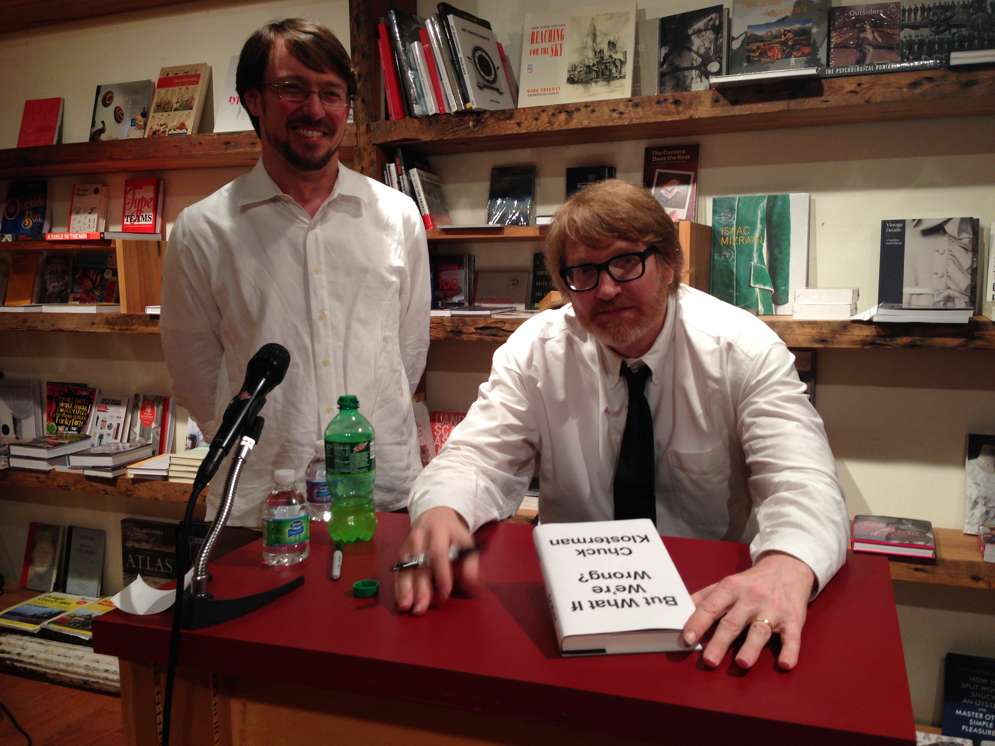
We’re going deep inside the making of a book, with interviews from Penguin Random House employees in editorial, marketing, sales, and more. If you’ve ever wondered about all the behind-the-scenes work that goes into making your favorite books, this is the series for you. But What If We’re Wrong? went on sale last Tuesday, and Chuck’s launch party was held at the Brooklyn Bookstore, BookCourt. Chuck read from his book and signed copies for fans… and it was a packed house! Today we’re featuring an interview with Andrew Unger, events and publicity manager of Brooklyn bookstore, BookCourt.What is your job title, and what does that mean? What’s your day to day? What would surprise a layman to know?
I am the events and publicity manager. My daily schedule is varied and unpredictable, but focuses primarily on acting as the voice and public face of BookCourt. I manage our Twitter, Facebook, Instagram, and the back-end of the BookCourt website. I do all of this in addition to coordinating events for the store. We have one of the most robust calendars of any bookstore in the city, supporting over 300 authors every year. I think everyone, layman and professionals, are surprised to find out just how genuinely moved I am by the opportunity I have to work at one of the premier independent bookstores in the country.
What’s it like working at BookCourt vs. any other bookstore?Jonathan Lethem has this wonderful quote he gave us once where he said that BookCourt was a university and a party in slow motion. I’ve always loved that way of talking about the store. As usual, Jonathan Lethem was able to put it so much better than me. On the weekends, we see a vast array of people. Old, young, local, tourist … it’s hard to not get a little whimsical about the “scene.” When you’re here and you’re the one that people look to for a recommendation or for a friendly conversation about one of your favorite books, it always feels almost too good to be true. I’ve only ever worked at BookCourt, but I don’t know that this particular blend of magic could be found anywhere else.
When you order books from a publishing company, what do you consider? What makes a book attractive to you and your customers?
We have store bestseller list at the front. This list features the bestselling books from the previous week. Consistently, these books reflect the same taste as reviewers for the New York Times, the New Yorker, and the New York Review of Books. Our customers prefer something sophisticated and intellectually stimulating. Proud as all of us are of our libraries, there’s just no escaping a good cover. Many bad books have been sold through good cover designs and, far and away, too many great books have been relegated to a dusty corner of the shelf because of an ill-advised cover. Occasionally, a truly great book will arrive in the store. Gone Girl or Building Stories. These are anomalous and rise to the top with a momentum born from nowhere else except the compelling narrative itself.
Tell me about some of the events and community-building at BookCourt.
In the early-aughts a Barnes & Noble opened up just a few blocks away from the store. It’s presence was intimidating and unwelcoming. The communities of Cobble Hill and Carroll Gardens rallied behind us in an impressive way. There are many great neighborhoods in New York, but these two have helped curate and foster one of the most impressive booms in Brooklyn. Today Court Street, as it runs from Atlantic Avenue into Red Hook, is ripe with local, family-owned businesses. In an age when small business is struggling for air, the residents of Cobble Hill and Carroll Gardens have created something truly special. Because of their dedication to us, we’ve dedicated ourselves to serving them. Our events are free and open to the public and through these events we are able to feature internationally celebrated authors as well as local and debut authors.
What’s interesting to you about But What if We’re Wrong? How would you describe it to a reader? Why would they want to read it?But What If We’re Wrong? was so engaging to me because it highlighted the best qualities of Chuck Klosterman’s personality. He is a friend of the store an often in and out. The writing is reflective of Chuck’s cadence and temperament. Thoroughly researched, he delivers prescient wisdom with a light-touch and a flare for the unexpected. The cover design, its simple, understated message of turning something on its head was ingenious and wonderful. I was the most surprised by how the footnotes at the bottom of the page operated as an aside to the reader in a way that looked at quick glance like a moniker of sophistication but read like a nudge and a wink. In almost every way, the book asked over and over again, the question of its title. Not often is a reading experience so cohesive and stream-lined.Which books are your go-to books to sell? Any old standbys?
People expect a booksellers to possess an intimate knowledge of not only all of their favorite books, but also of all the books they haven’t yet read. Great booksellers are up for the challenge. We all spend a lot of time pouring over reviews and ripping through as many books as we can. I don’t want to take the magic out of bookselling, but here are some pointers.
—Don’t recommend Bolano. Don’t be that guy. When you’re asked about it, gush appropriately because he’s amazing. Other writers that fall into this category are Don DeLillo, Thomas Pynchon, Dostoyevsky, J.D. Salinger, and Phillip Roth. (There’s a pattern)—Listen, listen, listen. What did they do that day? What movies do they like? Are they quiet, nervous, excited, busy, jaded? Most of the time, people know what book they want, you just have to listen to them describe it and pull it off the shelf.—Here is what you recommend in a pinch:
—The old stand-by: Stoner—Once in almost 5 years of bookselling, a customer came into the store and asked me to give her my top five favorite books of all time. No one ever asked me this before and took me seriously. Ask any bookseller what book they wish people would read more and they open up completely. For me, I think William Gass‘s The Tunnel is one of the most unappreciated masterpieces ever written. James McElroy’s Women and Men slipped out of print almost a decade ago and no one noticed … it’s the equivalent in my eyes of discovering that a DaVinci portrait was forgotten in the basement of a church abbey for generations.What’s the best thing about your job?No one rolls their eyes at me when I gush about the ways that certain books completely changed my life.Listen to our interview with Chuck Klosterman and his editor, Brant Rumble: Read first post in this series here, and find out more about But What If We’re Wrong here:
We’re going deep inside the making of a book, with interviews from Penguin Random House employees in editorial, marketing, sales, and more. If you’ve ever wondered about all the behind-the-scenes work that goes into making your favorite books, this is the series for you. Today we’re celebrating the publication of the book with an interview with the author, Chuck Klosterman and his longtime editor, Brant Rumble. In this episode of Beaks & Geeks, we talk about serial killers, Moby Dick, the publishing industry, sharing music, phantom time, and much more. Read first post in this series here, and find out more about But What If We’re Wrong here:
We’re going deep inside the making of a book, with interviews from Penguin Random House employees in editorial, marketing, sales, and more. If you’ve ever wondered about all the behind-the-scenes work that goes into making your favorite books, this is the series for you. Today we’re featuring an interview with Aileen Boyle: VP, Associate Publisher, Director of Marketing and Publicity for Blue Rider Press and Plume. What do you think is special or unique about this book? Why will readers want to get their hands on it?
Where to start? In this particular case, the reader should feel free to judge a book by its cover: the contents may turn your worldview upside down, or at least challenge you.
Designer Paul Sahre and art director Jason Booher hit it out of the park – this book could sit under glass at the Whitney and fit right in. Great design is such a helpful tool for a publicist to get the media’s attention as well as to stand out in a bookstore.
Now that we’ve gotten the reader to pick the book up, what should they expect between the covers? This is where the fun really begins. Chuck is a brilliant cultural commentator, not only in the way that he makes a point or constructs an argument, but in how he gets the reader thinking. But What If We’re Wrong? has something for everyone: literature, music, politics, science, philosophy and more. I’m not a sports person, but the chapter on football is fantastic and now I can drop that knowledge on my brother-in-law (finally). Other readers will likewise learn a few things, without question.
How would you describe your job and how you worked on But What If We’re Wrong? to a layman? What are some of the steps you take when you first start working on a title?
I’ll start with the end goal of my job: to have a reader discover a new book and get interested enough to buy it.
Booksellers, media and social media influencers are my outside partners to help me reach this goal. Booksellers have events. The media does reviews or interviews. Social media allows us to talk to readers or those they care about directly. My job, alongside my brilliant team, is to pull all of these levers for a book’s publication.
When a dynamic and popular writer like Chuck pens a provocative, forward-thinking book that can be read by a wide variety of people, I’ve got a lot to work with. I collaborated with author, publisher, editor and agent to set goals of how we wanted to reach readers and the message we wanted to convey. We started working on this early –about nine months (or more) ago. It’s exciting to be almost at the point of publication after all of this anticipation in-house.
Describe the book in one sentence.
A book that makes a persuasive case for the importance of doubt – sorely needed in an age where we think we know everything.
Do you have a favorite line from the book, or a section you particularly love?
While there is no material benefit to being right about a future you will not experience “there are intrinsic benefits,” Klosterman writes, “to constantly probing the possibility that our assumptions about the future might be wrong: humility and wonder. It’s good to view reality as being beyond our understanding, because it is. And it’s exciting to imagine the prospect of a reality that cannot be imagined, because that’s as close to pansophical omniscience as we will ever come.”
How closely do you work with the editor, art department, etc. when working on a title?
All members of our imprint work closely together. Publicity and marketing is the midwife in a book’s birth. The book has been gestating for a while– being written, edited, designed, printed, sold in by reps etc. – but then the labor begins, in the form of a publicity tour which can be physically exhausting and maybe even painful at times. But publicists are there at the crucial moment of publication day (a book’s birthday!) and when it’s well-received and sells lots of copies, I personally feel happy and proud by association.
(I might be saying this because my daughter kept me up last night and Chuck and his wife just had a baby, but I think the analogy is apt!)
Read first post in this series here, and find out more about But What If We’re Wrong here:
MAESTRA author, L.S. Hilton, came on the show to talk about the book that has it all: art, travel, money, sex, pop culture, food, feminism, and murder. She even has a stalker and is currently accepting applications for a proper troll.
Learn about the book here:
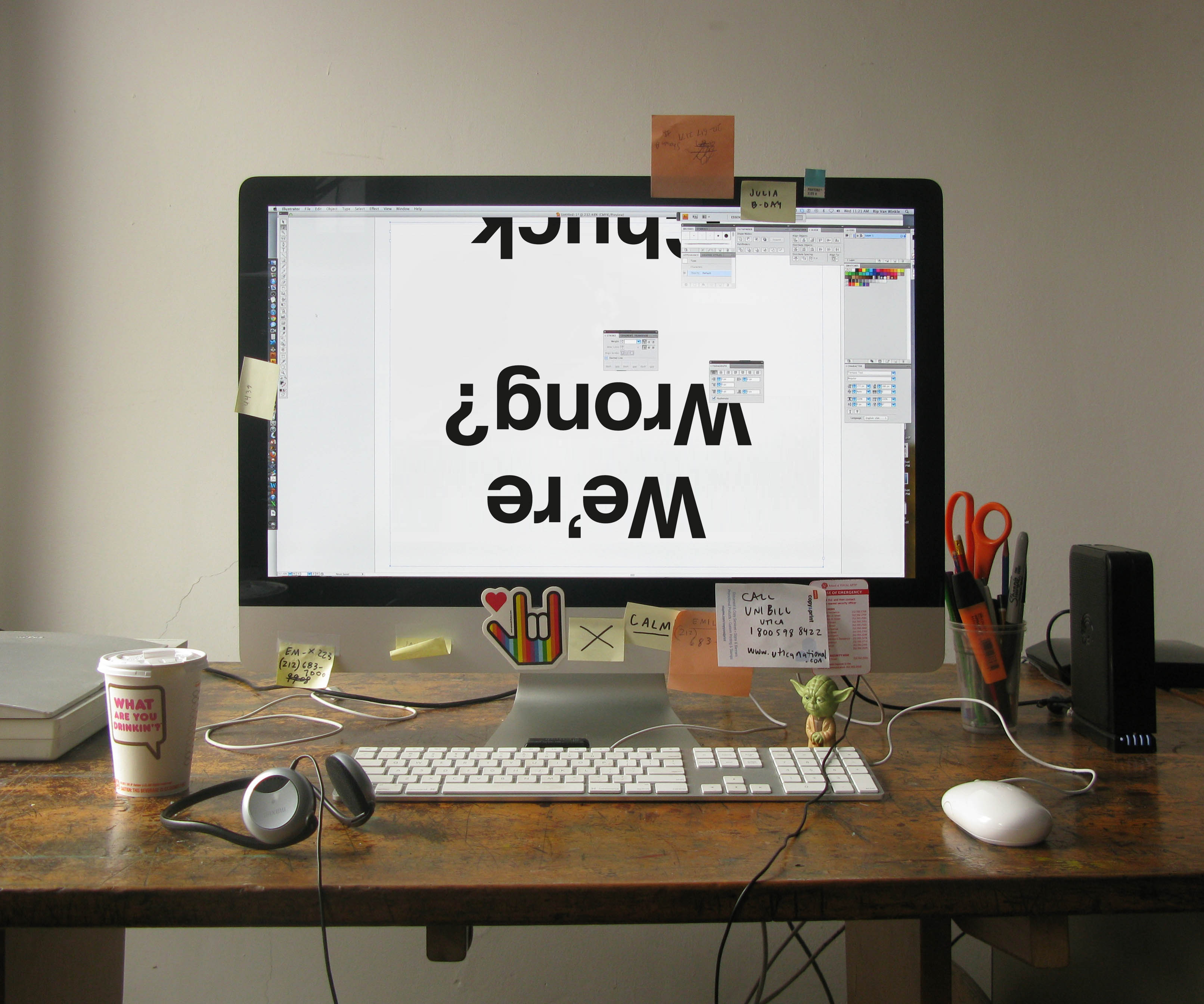
We’re going deep inside the making of a book, with interviews from Penguin Random House employees in editorial, marketing, sales, and more. If you’ve ever wondered about all the behind-the-scenes work that goes into making your favorite books, this is the series for you. Today we’re featuring an interview with Cover Designer, Paul Sahre.
You’ve worked with Chuck Klosterman for years – how has your approach to designing his cover changed over time?
It’s remained remarkably consistent. This comes from the systematic approach I have always taken with his covers. There are a number of rules that have evolved over the years, cover to cover: starting with the typeface, HELVETICA BOLD (all caps). There is usually some structure involving the typography that either interacts with or is set apart from a conceptual image. All of the images we have created for Chucks covers are oblique is a way that I think feels right for the author.
The new cover is a departure in that there is no imagery and we went upper and lower case with the type. But then again, this book is a bit of a departure for Chuck so the cover reflects that. He is dealing with some big ideas here so there is a monumental quality to the cover design that is inverted. Yet it still feels like a Chuck cover.
What were some of your other ideas for this cover? Why did you choose to pursue this particular one?
There was a cosmic thumbs up (or down) depending on how you held the book. There was a typographic design superimposed on a photograph of the cosmos. There was a pretzel in the shape of an infinity symbol and there was a fallen over question mark. I think the best cover won out.
Do you interact with the author when planning your design?
We have never had any direct contact during the design process. His reactions/concerns are communicated through the publisher (editor and the creative director). They sort of act as a buffer, which I’ve come to view as a good thing. When designer and author get together it often ends badly.
What is your favorite part of your job? What’s the hardest?
Covers are interesting because they need to do a number of things at the same time that are sort of at cross purposes.
On a purely functional level a jacket is there to protect the book, but I also like to think of a book cover as a door. It’s the beginning of the experience of reading.
A book cover should be appropriate, it should feel right (in an unexpected way) but it should also create an experience of its own.
Then there is the packaging (selling) of a book. Covers help sell books, but as the designer I can’t be concerned about that when I am designing the book. This is the publisher’s job. For me this concern translates more as trying to draw people to the cover in some way. So a good cover should engage.
Read first post in this series here, and find out more about But What If We’re Wrong here:


 How would you describe your collaborative process with Sophia?
The conversation is very open and fluid but also traditional in a lot of ways. For this book, we brainstormed the larger goals, overarching look and feel, and pulled inspiration together and discussed it all in very broad terms. Then Sophia went off and started collecting and creating the pieces of the book. We had a live working document in Google that we both had access to. Sophia would work on it pretty much daily and I would go in every few weeks at the beginning and make comments, notes, ask questions, make suggestions, etc. In this way, the book and its contents kept changing. Once the content felt mostly in place, we started doing the same thing with editing and making final selections, reordering, finding new images and replacing some images, etc. Eventually it felt finished enough to move to a “working manuscript.” Once we had this in place, we would each go off on our own to make notes and then get on the phone to go through the whole book—page by page—discussing our notes in detail, until the next round. We did this until there were no more notes…which was pretty much right up until the end.
How would you describe your collaborative process with Sophia?
The conversation is very open and fluid but also traditional in a lot of ways. For this book, we brainstormed the larger goals, overarching look and feel, and pulled inspiration together and discussed it all in very broad terms. Then Sophia went off and started collecting and creating the pieces of the book. We had a live working document in Google that we both had access to. Sophia would work on it pretty much daily and I would go in every few weeks at the beginning and make comments, notes, ask questions, make suggestions, etc. In this way, the book and its contents kept changing. Once the content felt mostly in place, we started doing the same thing with editing and making final selections, reordering, finding new images and replacing some images, etc. Eventually it felt finished enough to move to a “working manuscript.” Once we had this in place, we would each go off on our own to make notes and then get on the phone to go through the whole book—page by page—discussing our notes in detail, until the next round. We did this until there were no more notes…which was pretty much right up until the end.
 With so many photos, designs, letters, and more, what was the biggest challenge in making this book?
Editing! There were so many great individual pieces that felt worthy of inclusion so the weeding out process felt a little grueling sometimes, though necessary. Plus, every time one design element changes, the whole book changes, and needs to be looked at again as a whole.
What’s your favorite piece of advice in this book?
There is so much great advice in this book. Sophia is terrific at packing a lot of wisdom in her own pithy anecdote. The essays in Nasty Galaxy are small but pack a lot of punch. I think my favorite piece of advice, though, is in the essay “On Fear”: “Get attached. Stay attached. Just don’t forget to keep evolving.” I also like her instructions for How to Check Out of a Fancy Hotel because I couldn’t agree more. Why do people still go through a formal check-out process?
With so many photos, designs, letters, and more, what was the biggest challenge in making this book?
Editing! There were so many great individual pieces that felt worthy of inclusion so the weeding out process felt a little grueling sometimes, though necessary. Plus, every time one design element changes, the whole book changes, and needs to be looked at again as a whole.
What’s your favorite piece of advice in this book?
There is so much great advice in this book. Sophia is terrific at packing a lot of wisdom in her own pithy anecdote. The essays in Nasty Galaxy are small but pack a lot of punch. I think my favorite piece of advice, though, is in the essay “On Fear”: “Get attached. Stay attached. Just don’t forget to keep evolving.” I also like her instructions for How to Check Out of a Fancy Hotel because I couldn’t agree more. Why do people still go through a formal check-out process?
 What is your horoscope according to Nasty Galaxy?
Apparently I am an “intense mother*cker,”: really good at getting people on my side and have some jealous tendencies. I’d say it’s all true.
What would surprise readers to know about the making of this book?
It was harder to write and edit than #GIRLBOSS!
Find out more about this beautiful and unique book here:
What is your horoscope according to Nasty Galaxy?
Apparently I am an “intense mother*cker,”: really good at getting people on my side and have some jealous tendencies. I’d say it’s all true.
What would surprise readers to know about the making of this book?
It was harder to write and edit than #GIRLBOSS!
Find out more about this beautiful and unique book here:
 I think New York Magazine dubbed Johanna the “Queen of Coloring” for a number of reasons. She was one of the first people out there to invite adults into the coloring book realm. She’s got a marvelous artistic vision—she’s so exceptionally talented at creating intricate work that inspires colorists. And she’s also extremely generous, both as a person and as a creator. She’s said a number of times that she just starts the masterpieces, and her fans finish them. I think that generosity shows in her art and resonates with all her fans.
Watch Joanna Basford’s “Magical Jungle – An Inky Expedition & Coloring Book” video:
How did you come to acquire and edit your first adult coloring book and how did the process compare with how you work with Johanna on her books?
When I was at Perigee, I acquired my first two coloring books at roughly the same time:
I think New York Magazine dubbed Johanna the “Queen of Coloring” for a number of reasons. She was one of the first people out there to invite adults into the coloring book realm. She’s got a marvelous artistic vision—she’s so exceptionally talented at creating intricate work that inspires colorists. And she’s also extremely generous, both as a person and as a creator. She’s said a number of times that she just starts the masterpieces, and her fans finish them. I think that generosity shows in her art and resonates with all her fans.
Watch Joanna Basford’s “Magical Jungle – An Inky Expedition & Coloring Book” video:
How did you come to acquire and edit your first adult coloring book and how did the process compare with how you work with Johanna on her books?
When I was at Perigee, I acquired my first two coloring books at roughly the same time:  In the years since, the coloring book audience has become a lot more opinionated and sophisticated about what they want in a coloring book, so with Johanna’s titles, we’ve spent a lot of time with our amazing production team looking at paper weight, opacity, etc. When I worked on those first two books, I never imagined that several years down the line, I’d be spending as much time talking about the merits of white vs ivory paper as I do now. But we want to keep those colorists happy!
In addition to adult coloring books, what are a couple of the upcoming books you are editing that are of most interest and what do you hope will distinguish them?
I’m publishing a book called
In the years since, the coloring book audience has become a lot more opinionated and sophisticated about what they want in a coloring book, so with Johanna’s titles, we’ve spent a lot of time with our amazing production team looking at paper weight, opacity, etc. When I worked on those first two books, I never imagined that several years down the line, I’d be spending as much time talking about the merits of white vs ivory paper as I do now. But we want to keep those colorists happy!
In addition to adult coloring books, what are a couple of the upcoming books you are editing that are of most interest and what do you hope will distinguish them?
I’m publishing a book called  I’m also really excited about two other books I have coming out this fall:
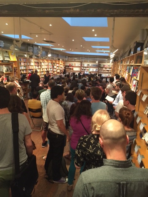
 Chuck read from his book and signed copies for fans… and it was a packed house!
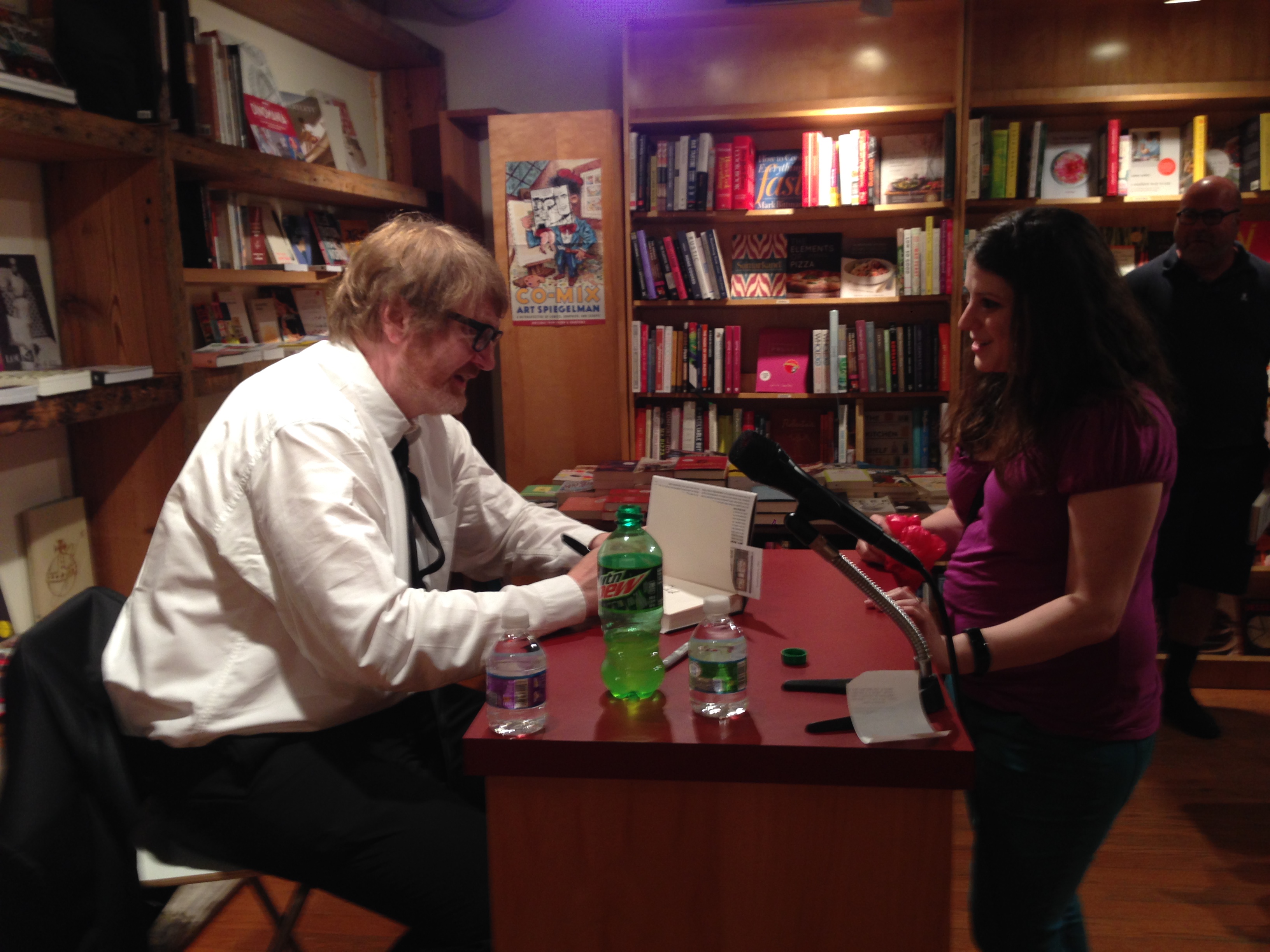 Today we’re featuring an interview with Andrew Unger, events and publicity manager of Brooklyn bookstore, BookCourt.
What is your job title, and what does that mean? What’s your day to day? What would surprise a layman to know?
I am the events and publicity manager. My daily schedule is varied and unpredictable, but focuses primarily on acting as the voice and public face of BookCourt. I manage our
Today we’re featuring an interview with Andrew Unger, events and publicity manager of Brooklyn bookstore, BookCourt.
What is your job title, and what does that mean? What’s your day to day? What would surprise a layman to know?
I am the events and publicity manager. My daily schedule is varied and unpredictable, but focuses primarily on acting as the voice and public face of BookCourt. I manage our 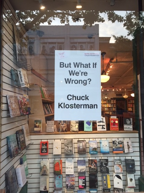 When you order books from a publishing company, what do you consider? What makes a book attractive to you and your customers?
We have store bestseller list at the front. This list features the bestselling books from the previous week. Consistently, these books reflect the same taste as reviewers for the New York Times, the New Yorker, and the New York Review of Books. Our customers prefer something sophisticated and intellectually stimulating. Proud as all of us are of our libraries, there’s just no escaping a good cover. Many bad books have been sold through good cover designs and, far and away, too many great books have been relegated to a dusty corner of the shelf because of an ill-advised cover. Occasionally, a truly great book will arrive in the store.
When you order books from a publishing company, what do you consider? What makes a book attractive to you and your customers?
We have store bestseller list at the front. This list features the bestselling books from the previous week. Consistently, these books reflect the same taste as reviewers for the New York Times, the New Yorker, and the New York Review of Books. Our customers prefer something sophisticated and intellectually stimulating. Proud as all of us are of our libraries, there’s just no escaping a good cover. Many bad books have been sold through good cover designs and, far and away, too many great books have been relegated to a dusty corner of the shelf because of an ill-advised cover. Occasionally, a truly great book will arrive in the store.